
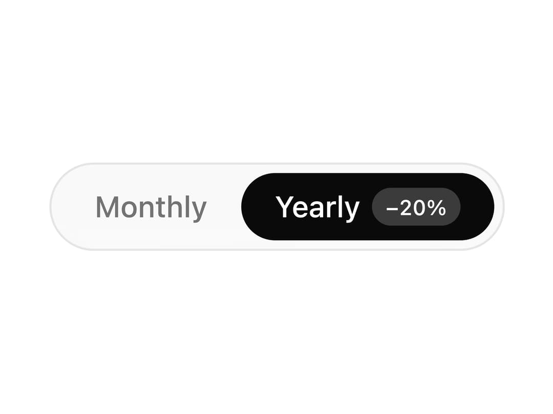
About
A radio-group style switch between a few options with an animated pill that slides to the selected choice, used for things like billing period toggles.
Built with React and Tailwind. Copy the prompt and paste it into Claude Code, Cursor or Lovable: your agent adds Segmented Control to your project and fits it to your theme.
Code
How Segmented Control is used: the demo's code. The component's own source comes with a free account.
Usage.tsx
"use client";

import * as React from "react";

import SegmentedControl from "@/components/ui/segmented-control";

const options = [
  { value: "monthly" as const, label: "Monthly" },
  { value: "yearly" as const, label: "Yearly", badge: "−20%" },
];

export default function SegmentedControlDemo() {
  const [billing, setBilling] = React.useState<"monthly" | "yearly">("yearly");

  return (
    <SegmentedControl
      aria-label="Billing period"
      value={billing}
      onValueChange={setBilling}
      options={options}
    />
  );
}
Dependencies
More by Théo Balick
View all
Interactive Grid
89
Footer With Newsletter
67
Services List
30
Wave Lines
23
Expandable Text
15
Underline Link
12
Mask Reveal
9
Expand Button
8
More in Pricing
View all
Pricing Section
660

Pricing Card
382

Pricing Section
190

Pricing Cards
22
pricing section
170
Glowing Pricing Tiers
85
Colorful-Pricing
87
Stats cards with links
35


