About
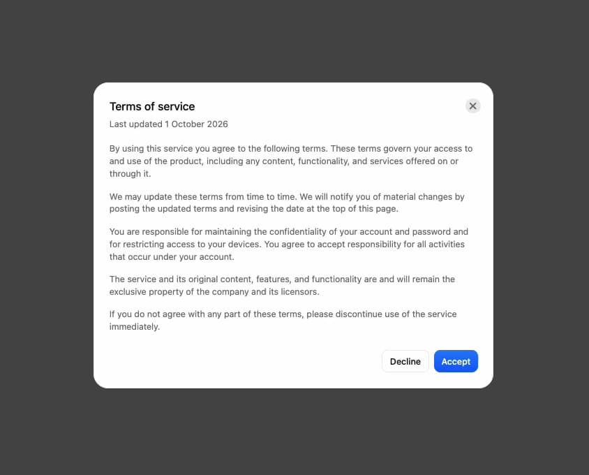
A centered dialog over a dimmed backdrop with a header, a scrollable body and footer actions, plus a built-in alert dialog preset for destructive-action confirmations.
Built with React and Tailwind. Copy the prompt and paste it into Claude Code, Cursor or Lovable: your agent adds Modal Dialog to your project and fits it to your theme.
Code
How Modal Dialog is used: the demo's code. The component's own source comes with a free account.
Usage.tsx
"use client";

import {
  Modal,
  ModalBody,
  ModalFooter,
  ModalHeader,
  ModalTrigger,
} from "@/components/ui/modal";
import { RiFileTextLine } from "@remixicon/react";

export default function ModalDemo() {
  return (
    <div className="flex min-h-screen w-full items-center justify-center bg-background-full p-10">
      <ModalTrigger>
        <button
          type="button"
          className="button-press-motion inline-flex h-9 items-center justify-center gap-1.5 rounded-2lg border border-border-button-default bg-background-primary-default px-3 text-body-medium text-text-primary outline-none hover:bg-background-primary-hover focus-visible:ring-2 focus-visible:ring-border-focus-ring focus-visible:ring-offset-2"
        >
          <RiFileTextLine className="size-[18px]" aria-hidden />
          Review terms
        </button>
        <Modal size="lg">
          {({ close }) => (
            <>
              <ModalHeader
                title="Terms of service"
                description="Last updated 1 October 2026"
              />
              <ModalBody>
                <p className="mb-4">
                  By using this service you agree to the following terms. These
                  terms govern your access to and use of the product, including
                  any content, functionality, and services offered on or through
                  it.
                </p>
                <p className="mb-4">
                  We may update these terms from time to time. We will notify
                  you of material changes by posting the updated terms and
                  revising the date at the top of this page.
                </p>
                <p className="mb-4">
                  You are responsible for maintaining the confidentiality of
                  your account and password and for restricting access to your
                  devices. You agree to accept responsibility for all activities
                  that occur under your account.
                </p>
                <p className="mb-4">
                  The service and its original content, features, and
                  functionality are and will remain the exclusive property of
                  the company and its licensors.
                </p>
                <p>
                  If you do not agree with any part of these terms, please
                  discontinue use of the service immediately.
                </p>
              </ModalBody>
              <ModalFooter>
                <button
                  type="button"
                  onClick={close}
                  className="button-press-motion inline-flex h-9 items-center justify-center rounded-2lg border border-border-button-default bg-background-primary-default px-3 text-body-medium text-text-primary hover:bg-background-primary-hover"
                >
                  Decline
                </button>
                <button
                  type="button"
                  onClick={close}
                  className="button-press-motion inline-flex h-9 items-center justify-center rounded-2lg bg-button-primary px-3 text-body-medium text-text-white"
                >
                  Accept
                </button>
              </ModalFooter>
            </>
          )}
        </Modal>
      </ModalTrigger>
    </div>
  );
}
Dependencies
More by boardui
View all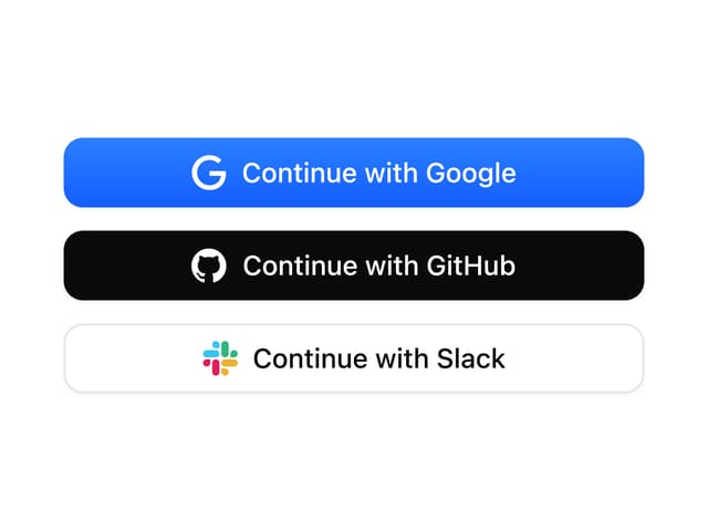

Social Button
3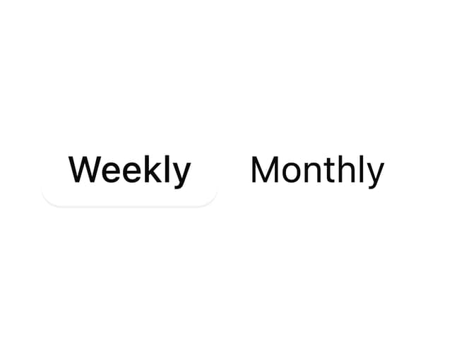
Segmented Control
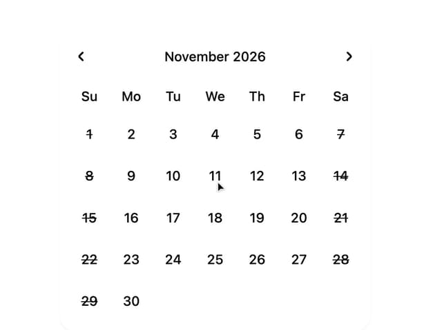
Date Calendar
Select
Composer Loader
Slider
File Upload
Context Menu