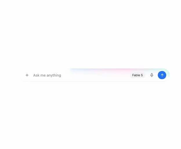
About
A loading overlay that wraps a chat composer input with an animated iridescent light band traveling around its rim while an AI agent is generating a response.
Built with React and Tailwind. Copy the prompt and paste it into Claude Code, Cursor or Lovable: your agent adds Composer Loader to your project and fits it to your theme.
Code
How Composer Loader is used: the demo's code. The component's own source comes with a free account.
Usage.tsx
"use client";

import ComposerLoader from "@/components/ui/composer-loader";
import { Plus, Mic, ArrowUp } from "lucide-react";
import * as React from "react";

export default function ComposerLoaderDemo() {
  const [active, setActive] = React.useState(true);

  React.useEffect(() => {
    const id = setInterval(() => setActive((a) => !a), 3200);
    return () => clearInterval(id);
  }, []);

  return (
    <div className="flex min-h-[320px] w-full items-center justify-center bg-background p-8">
      <ComposerLoader active={active} className="w-full max-w-xl">
        <div className="flex items-center gap-2 rounded-full bg-transparent px-3 py-2">
          <button
            type="button"
            className="flex h-8 w-8 shrink-0 items-center justify-center rounded-full text-neutral-500 hover:bg-neutral-100 dark:hover:bg-neutral-800"
          >
            <Plus className="h-4 w-4" />
          </button>
          <input
            placeholder="Ask me anything"
            className="flex-1 bg-transparent text-sm text-neutral-900 outline-none placeholder:text-neutral-400 dark:text-neutral-100"
          />
          <span className="shrink-0 rounded-full bg-neutral-100 px-2.5 py-1 text-xs text-neutral-600 dark:bg-neutral-800 dark:text-neutral-300">
            Fable 5
          </span>
          <button
            type="button"
            className="flex h-8 w-8 shrink-0 items-center justify-center rounded-full text-neutral-500 hover:bg-neutral-100 dark:hover:bg-neutral-800"
          >
            <Mic className="h-4 w-4" />
          </button>
          <button
            type="button"
            className="flex h-8 w-8 shrink-0 items-center justify-center rounded-full bg-blue-500 text-white"
          >
            <ArrowUp className="h-4 w-4" />
          </button>
        </div>
      </ComposerLoader>
    </div>
  );
}
Dependencies
More by boardui
View all

Social Button
3
Segmented Control
Date Calendar
Select
Modal Dialog
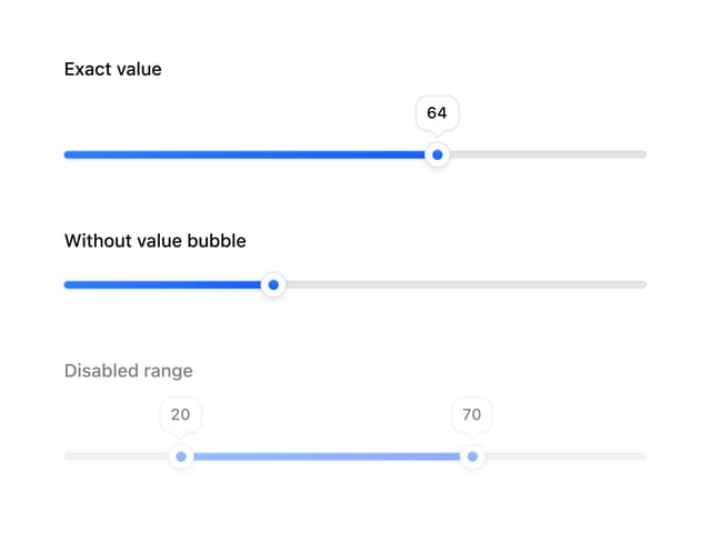
Slider
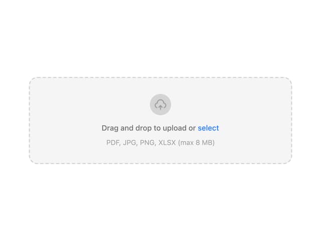
File Upload
Context Menu
More in AI chats
View all

AI Actions
352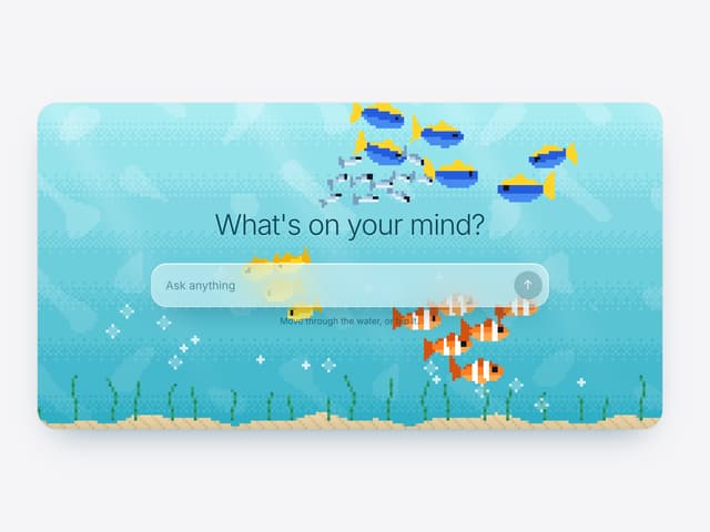

Aquarium Prompt
115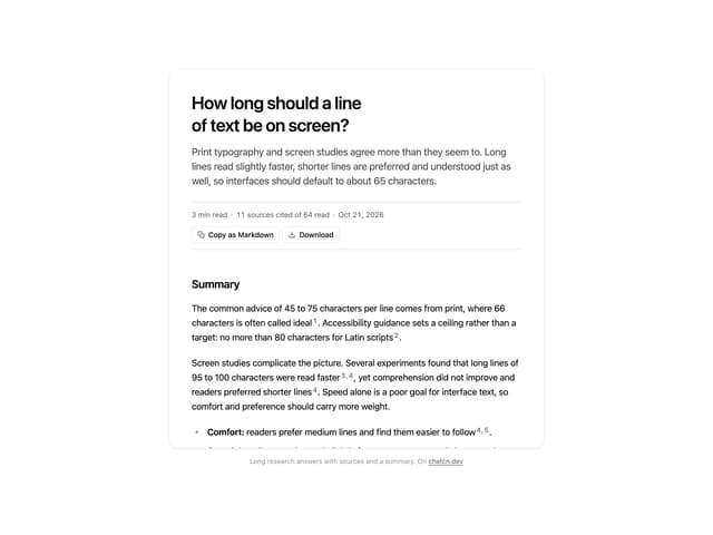
Research Report
7
Agent Chat
21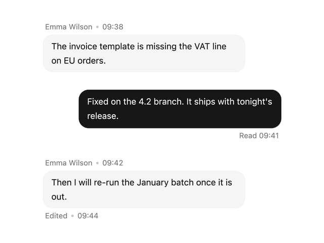

Message With Header And Delivery Status
62
Tool Web Fetch
4
Color Picker
204
Suggestions
40


