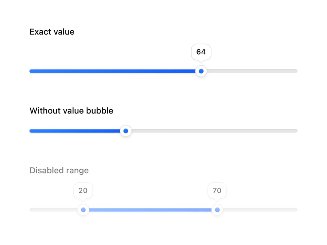
About
A single-value or min/max range slider with draggable thumbs, exact-value bubbles, and full keyboard control.
Built with React and Tailwind. Copy the prompt and paste it into Claude Code, Cursor or Lovable: your agent adds Slider to your project and fits it to your theme.
Code
How Slider is used: the demo's code. The component's own source comes with a free account.
Usage.tsx
import { RangeSlider, Slider } from "@/components/ui/slider";

export default function SliderStatesDemo() {
  return (
    <div className="flex w-full max-w-md flex-col gap-10">
      <Slider label="Exact value" defaultValue={64} />
      <Slider
        label="Without value bubble"
        defaultValue={36}
        showTooltip={false}
      />
      <RangeSlider label="Disabled range" defaultValue={[20, 70]} isDisabled />
    </div>
  );
}
Dependencies
More by boardui
View all

Social Button
3
Modal Dialog
1
Segmented Control
Date Calendar
Select

Composer Loader
File Upload
Context Menu