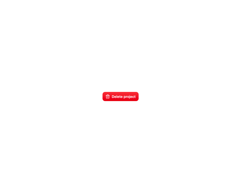
About
A centered dialog over a dimmed backdrop with a header, a scrollable body and footer actions, plus a built-in alert dialog preset for destructive-action confirmations.
Built with React and Tailwind. Copy the prompt and paste it into Claude Code, Cursor or Lovable: your agent adds Modal Dialog to your project and fits it to your theme.
Code
How Modal Dialog is used: the demo's code. The component's own source comes with a free account.
Usage.tsx
"use client";

import { AlertDialog, ModalTrigger } from "@/components/ui/modal";
import { RiDeleteBinLine } from "@remixicon/react";

async function deleteProject(projectId: string) {
  await new Promise((resolve) => setTimeout(resolve, 1200));
}

export default function AlertDialogDemo() {
  return (
    <div className="flex min-h-screen w-full items-center justify-center bg-background-full p-10">
      <ModalTrigger>
        <button
          type="button"
          className="button-press-motion inline-flex h-9 items-center justify-center gap-1.5 rounded-2lg bg-button-danger px-3 text-body-medium text-text-white outline-none focus-visible:ring-2 focus-visible:ring-border-focus-ring focus-visible:ring-offset-2"
        >
          <RiDeleteBinLine className="size-[18px]" aria-hidden />
          Delete project
        </button>
        <AlertDialog
          title="Delete project?"
          description="Acme Dashboard and its 24 files will be deleted for everyone. You can't undo this."
          confirmLabel="Delete project"
          pendingLabel="Deleting..."
          onConfirm={() => deleteProject("acme-dashboard")}
        />
      </ModalTrigger>
    </div>
  );
}
Dependencies
More by boardui
View all

Social Button
3
Segmented Control
Date Calendar
Select
Composer Loader
Slider
File Upload
Context Menu