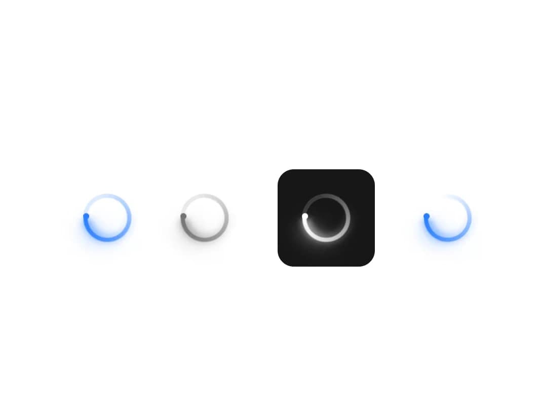
About
A small circular loading indicator with an orbiting glow, in five sizes, for buttons and other areas of unknown wait time.
Built with React and Tailwind. Copy the prompt and paste it into Claude Code, Cursor or Lovable: your agent adds Spinner to your project and fits it to your theme.
Code
How Spinner is used: the demo's code. The component's own source comes with a free account.
Usage.tsx
import { Spinner } from "@/components/ui/spinner";

export default function SpinnerColorsDemo() {
  return (
    <div className="flex h-screen w-full items-center justify-center gap-6">
      <Spinner size="lg" />
      <Spinner size="lg" className="text-text-secondary" />
      <div className="flex items-center justify-center rounded-md bg-accent-500 p-3">
        <Spinner size="lg" className="text-white" />
      </div>
      <Spinner size="lg" track={false} />
    </div>
  );
}
Dependencies
More by boardui
View all

Social Button
Notification Center
Dropdown
Icon Button
Chip