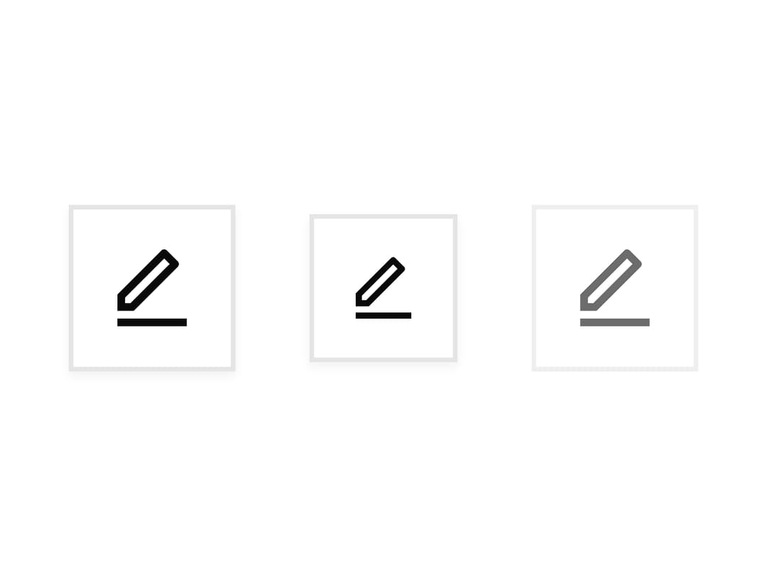
About
A square icon-only button component with medium and small sizes, used for compact actions like edit or notification controls in toolbars and table rows.
Built with React and Tailwind. Copy the prompt and paste it into Claude Code, Cursor or Lovable: your agent adds Icon Button to your project and fits it to your theme.
Code
How Icon Button is used: the demo's code. The component's own source comes with a free account.
Usage.tsx
import { IconButton } from "@/components/ui/icon-button";
import { RiEditLine } from "@remixicon/react";

export default function IconButtonSizesDemo() {
  return (
    <div className="flex items-center gap-4">
      <IconButton icon={RiEditLine} size="medium" aria-label="Edit" />
      <IconButton icon={RiEditLine} size="small" aria-label="Edit" />
      <IconButton icon={RiEditLine} aria-label="Edit" disabled />
    </div>
  );
}
Dependencies
More by boardui
View all

Social Button

Notification Center
Spinner
Dropdown
Chip
More in Buttons
View all
Button
9
Texture Button
101

Button
1

App Store Button
472
Native Button
12

Eclipse Button
3
Figma File Button
35

HeroUI Button Group
1


