About
A composable popover menu with a trigger, grouped rows, dividers and headers/footers, for sidebar team or account menus and chat composer "add" menus.
Built with React and Tailwind. Copy the prompt and paste it into Claude Code, Cursor or Lovable: your agent adds Dropdown to your project and fits it to your theme.
Code
How Dropdown is used: the demo's code. The component's own source comes with a free account.
Usage.tsx
"use client";

import {
  Dropdown,
  DropdownGroup,
  DropdownItem,
  DropdownPopover,
  DropdownTrigger,
} from "@/components/ui/dropdown";
import { cx } from "@/components/ui/dropdown-utils/cx";
import {
  RiAddLine,
  RiAttachment2,
  RiFocus3Line,
  RiListCheck3,
} from "@remixicon/react";
import { useState } from "react";

const ROWS = [
  { icon: RiAttachment2, label: "Files and folders" },
  {
    icon: RiFocus3Line,
    label: "Goal",
    description: "Set a goal for faster results",
  },
  {
    icon: RiListCheck3,
    label: "Plan mode",
    description: "Manage complex tasks",
  },
];

export default function DropdownDemo() {
  const [isOpen, setIsOpen] = useState(false);

  return (
    <div className="flex h-screen w-full items-center justify-center bg-background">
      <Dropdown isOpen={isOpen} onOpenChange={setIsOpen}>
        <DropdownTrigger
          aria-label="Add to chat"
          className="flex size-9 items-center justify-center rounded-full bg-background-secondary-default p-2 transition-colors hover:bg-background-secondary-hover"
        >
          <RiAddLine
            className={cx(
              "size-5 text-foreground-icon-secondary transition-transform duration-200",
              isOpen && "rotate-45",
            )}
            aria-hidden
          />
        </DropdownTrigger>

        <DropdownPopover
          aria-label="Add to chat"
          className="w-[361px] p-2"
          dialogClassName="gap-2"
        >
          <DropdownGroup label="Add">
            {ROWS.map(({ icon: Icon, label, description }) => (
              <DropdownItem
                key={label}
                onSelect={() => setIsOpen(false)}
                className="px-2 py-1.5"
              >
                <Icon
                  className="size-5 shrink-0 text-foreground-icon-secondary"
                  aria-hidden
                />
                <span className="truncate text-body-medium whitespace-nowrap">
                  <span className="text-text-primary">{label}</span>
                  {description && (
                    <span className="ml-1.5 text-text-secondary">
                      {description}
                    </span>
                  )}
                </span>
              </DropdownItem>
            ))}
          </DropdownGroup>
        </DropdownPopover>
      </Dropdown>
    </div>
  );
}
Dependencies
More by boardui
View all

Social Button
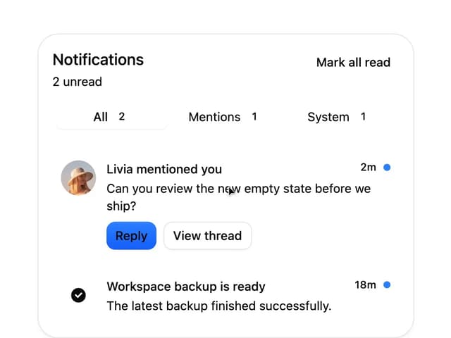
Notification Center
Spinner
Icon Button
Chip
More in Navigation
View all

Sidebar
351

Oversized 404 Numeral
69
Navbar with Theme Toggle
57
Footer
453

Outline Pagination
11
Navbar
8
Pagination Ant
3
Breadcramb
93


