
About
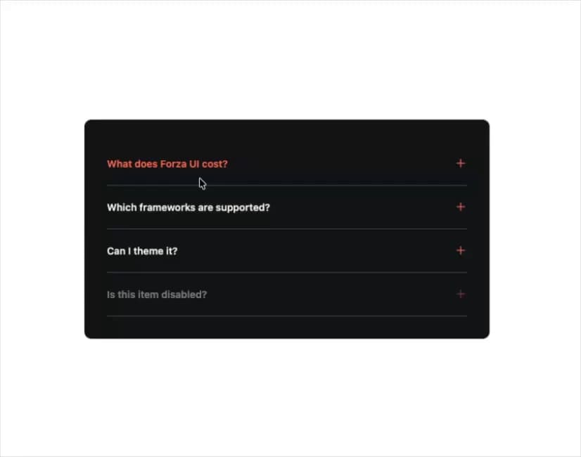
A single-open accordion for FAQs and collapsible content panels, ported from Forza UI's Vue component to React with the same markup, class names, and spring/rise-in animations (credit: Chris Dalbano / Forza UI).
Built with React and Tailwind. Copy the prompt and paste it into Claude Code, Cursor or Lovable: your agent adds Fz Accordion to your project and fits it to your theme.
Code
How Fz Accordion is used: the demo's code. The component's own source comes with a free account.
Usage.tsx
import FzAccordion, {
  type ForzaAccordionItem,
} from "@/components/ui/fz-accordion";

const items: ForzaAccordionItem[] = [
  {
    value: "pricing",
    title: "What does Forza UI cost?",
    content:
      "Forza UI ships under the MIT license, so every primitive is free to use in commercial and personal projects.",
  },
  {
    value: "frameworks",
    title: "Which frameworks are supported?",
    content:
      "The kit ships parallel Vue and React packages that share the same design tokens, so teams can mix and match without redesigning anything.",
  },
  {
    value: "theming",
    title: "Can I theme it?",
    content:
      "Yes — every component reads from a small set of CSS variables (--fz-accent, --fz-border, --fz-text…) so swapping a theme is a few lines of CSS.",
  },
  {
    value: "support",
    title: "Is this item disabled?",
    content: "This row is disabled to demonstrate the reduced-opacity state.",
    disabled: true,
  },
];

export default function FzAccordionDemo() {
  return (
    <div
      style={{ background: "#101416", color: "#f2efe6" }}
      className="w-full max-w-xl rounded-lg p-8"
    >
      <FzAccordion items={items} label="Frequently asked questions" />
    </div>
  );
}
Dependencies
More by chrisdalbano
View all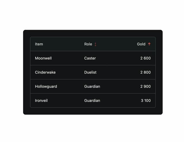
Forza Table
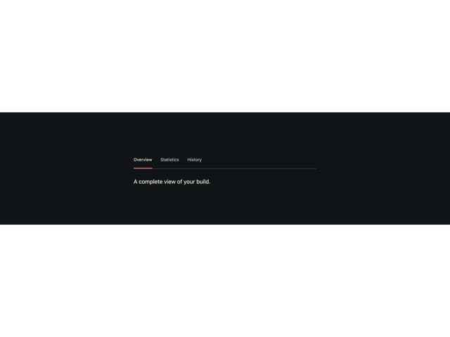
Fz Tabs
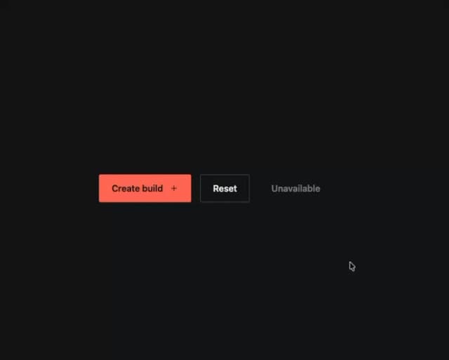
Forza Button