About
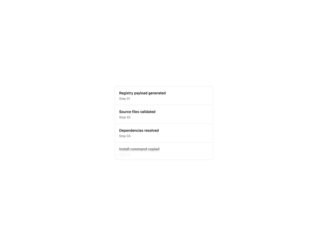
A scrollable container that fades content into blurred gradient edges on the top, bottom, left, and right, with optional scroll-snap item helpers.
Built with React and Tailwind. Copy the prompt and paste it into Claude Code, Cursor or Lovable: your agent adds Scroll Blur to your project and fits it to your theme.
Code
How Scroll Blur is used: the demo's code. The component's own source comes with a free account.
Usage.tsx
import { ScrollBlur } from "@/components/ui/scroll-blur"

const steps = [
  { title: "Registry payload generated", step: "Step 01" },
  { title: "Source files validated", step: "Step 02" },
  { title: "Dependencies resolved", step: "Step 03" },
  { title: "Install command copied", step: "Step 04" },
  { title: "Preview screenshots updated", step: "Step 05" },
  { title: "Metrics synced", step: "Step 06" },
  { title: "Docs examples checked", step: "Step 07" },
  { title: "Deployment queued", step: "Step 08" },
]

export default function ScrollBlurDemo() {
  return (
    <div className="flex min-h-[440px] w-full items-center justify-center bg-background p-6">
      <ScrollBlur edgeSize={48} className="h-72 w-full max-w-sm rounded-lg border">
        <div className="flex flex-col divide-y">
          {steps.map((item) => (
            <div key={item.step} className="flex flex-col gap-1 p-4">
              <span className="text-sm font-medium text-foreground">
                {item.title}
              </span>
              <span className="text-xs text-muted-foreground">{item.step}</span>
            </div>
          ))}
        </div>
      </ScrollBlur>
    </div>
  )
}
Dependencies
More by corr
View all

Audit Log
83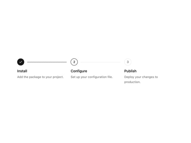
Stepper
59
Notice Alert
36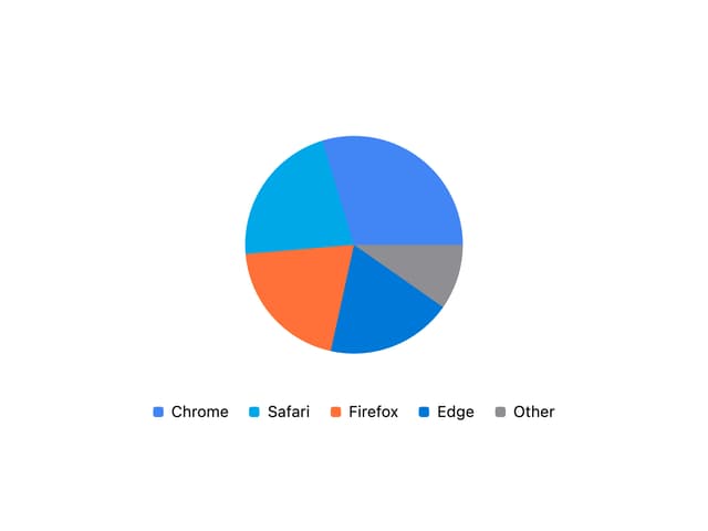
Pie Chart
8
Key Value List
7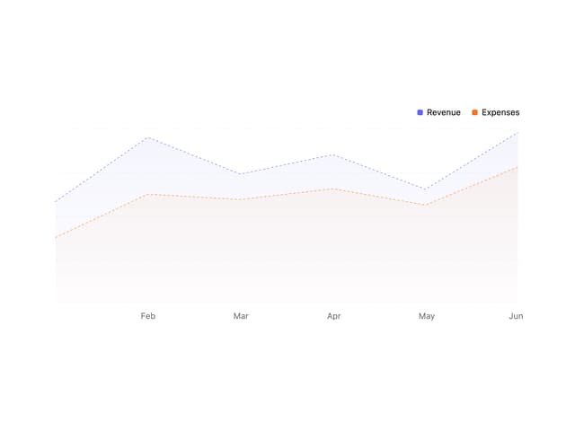
Area Chart
4
Animated Spinner
3
Presence Fade
2