About
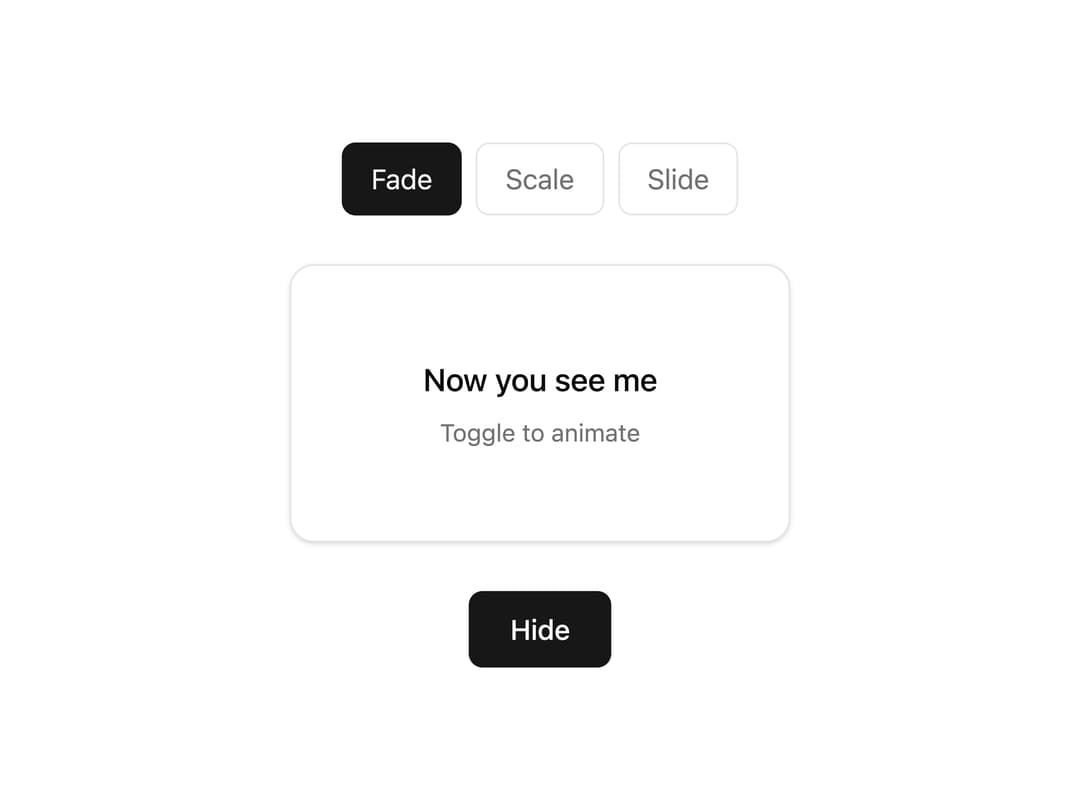
A tiny mount and unmount wrapper that animates children with fade, scale, or slide transitions.
Built with React and Tailwind. Copy the prompt and paste it into Claude Code, Cursor or Lovable: your agent adds Presence Fade to your project and fits it to your theme.
Code
How Presence Fade is used: the demo's code. The component's own source comes with a free account.
Usage.tsx
"use client";

import { PresenceFade } from "@/components/ui/presence-fade";
import { useState } from "react";

type Mode = "fade" | "scale" | "slide";

export default function PresenceFadeDemo() {
  const [show, setShow] = useState(true);
  const [mode, setMode] = useState<Mode>("fade");

  const modes: Mode[] = ["fade", "scale", "slide"];

  return (
    <div className="flex w-fit flex-col items-center gap-7 bg-background p-10 text-foreground">
      <div className="flex items-center gap-2">
        {modes.map((m) => (
          <button
            key={m}
            onClick={() => setMode(m)}
            className={`rounded-md border px-4 py-2 text-base capitalize transition-colors ${
              mode === m
                ? "border-primary bg-primary text-primary-foreground"
                : "border-border bg-transparent text-muted-foreground hover:text-foreground"
            }`}
          >
            {m}
          </button>
        ))}
      </div>

      <div className="flex h-40 items-center justify-center">
        <PresenceFade show={show} mode={mode}>
          <div className="flex h-40 w-72 flex-col items-center justify-center gap-1.5 rounded-xl border border-border bg-card p-6 text-card-foreground shadow-sm">
            <span className="text-lg font-medium">Now you see me</span>
            <span className="text-sm text-muted-foreground">
              Toggle to animate
            </span>
          </div>
        </PresenceFade>
      </div>

      <button
        onClick={() => setShow((s) => !s)}
        className="rounded-md bg-primary px-6 py-2.5 text-base font-medium text-primary-foreground transition-opacity hover:opacity-90"
      >
        {show ? "Hide" : "Show"}
      </button>
    </div>
  );
}
Dependencies
More by corr
View all

Audit Log
91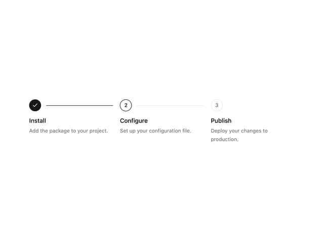
Stepper
67
Notice Alert
41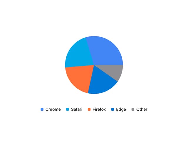
Pie Chart
8
Scroll Blur
8
Key Value List
7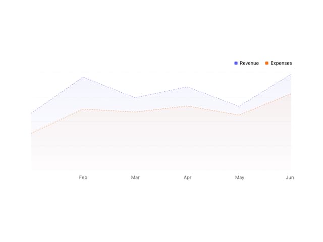
Area Chart
4
Animated Spinner
4
More in Cards
View all

Course Design Cards
1.1K

Statistics Card 7
301
Statistics Card 2
275
Card
70

Interactive Tech Stack Bento Grid with Hover Effects
207
Stats cards with links
83

Weather Card
58

Card Studio
10
