
About
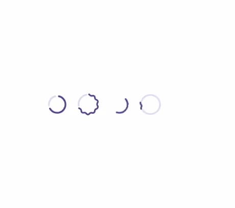
A circular loading/progress indicator with determinate and indeterminate states, in Material 3's flat or wavy style.
Built with React and Tailwind. Copy the prompt and paste it into Claude Code, Cursor or Lovable: your agent adds Circular Progress to your project and fits it to your theme.
Code
How Circular Progress is used: the demo's code. The component's own source comes with a free account.
Usage.tsx
import { CircularProgress } from "@/components/ui/circular-progress";

export default function CircularProgressDemo() {
  return (
    <div className="flex min-h-32 flex-wrap items-center justify-center gap-6 p-6">
      <CircularProgress aria-label="Example progress" value={70} />
      <CircularProgress
        aria-label="Example progress"
        value={70}
        variant="wavy"
      />
      <CircularProgress aria-label="Example progress" />
      <CircularProgress aria-label="Example progress" variant="wavy" />
    </div>
  );
}
More by crysta1221
View all
Attachment
21
M3 Expressive Button
20
Input OTP
Field
List Item
Empty