
About
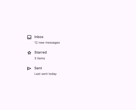
A row component for building lists — with media, title, description, actions and header/footer slots — including a segmented variant whose corners round up on hover, press and selection.
Built with React and Tailwind. Copy the prompt and paste it into Claude Code, Cursor or Lovable: your agent adds List Item to your project and fits it to your theme.
Code
How List Item is used: the demo's code. The component's own source comes with a free account.
Usage.tsx
import {
  Item,
  ItemContent,
  ItemDescription,
  ItemGroup,
  ItemMedia,
  ItemTitle,
} from "@/components/ui/item";

// Material Symbols Rounded (outline), the same glyphs the original demo
// renders via the registry's offline Icon component.
const ICON_PATHS: Record<string, string> = {
  inbox:
    "M5 21q-.825 0-1.412-.587T3 19V5q0-.825.588-1.412T5 3h14q.825 0 1.413.588T21 5v14q0 .825-.587 1.413T19 21zm0-2h14v-3h-3q-.75.95-1.787 1.475T12 18t-2.212-.525T8 16H5zm7-3q.8 0 1.475-.413t1.1-1.087q.15-.225.375-.363t.5-.137H19V5H5v9h3.55q.275 0 .5.138t.375.362q.425.675 1.1 1.088T12 16m-7 3h14z",
  star: "m8.85 16.825l3.15-1.9l3.15 1.925l-.825-3.6l2.775-2.4l-3.65-.325l-1.45-3.4l-1.45 3.375l-3.65.325l2.775 2.425zm3.15.45l-4.15 2.5q-.275.175-.575.15t-.525-.2t-.35-.437t-.05-.588l1.1-4.725L3.775 10.8q-.25-.225-.312-.513t.037-.562t.3-.45t.55-.225l4.85-.425l1.875-4.45q.125-.3.388-.45t.537-.15t.537.15t.388.45l1.875 4.45l4.85.425q.35.05.55.225t.3.45t.038.563t-.313.512l-3.675 3.175l1.1 4.725q.075.325-.05.588t-.35.437t-.525.2t-.575-.15zm0-5.025",
  send: "m19.8 12.925l-15.4 6.5q-.5.2-.95-.088T3 18.5v-13q0-.55.45-.837t.95-.088l15.4 6.5q.625.275.625.925t-.625.925M5 17l11.85-5L5 7v3.5l6 1.5l-6 1.5zm0 0V7z",
};

function Icon({ name }: { name: string }) {
  return (
    <svg
      aria-hidden
      width={24}
      height={24}
      viewBox="0 0 24 24"
      className="inline-block shrink-0 align-middle"
    >
      <path fill="currentColor" d={ICON_PATHS[name]} />
    </svg>
  );
}

export default function Demo() {
  return (
    <ItemGroup className="max-w-md">
      {[
        ["inbox", "Inbox", "12 new messages"],
        ["star", "Starred", "3 items"],
        ["send", "Sent", "Last sent today"],
      ].map(([icon, title, text]) => (
        <Item key={title} variant="segmented" render={<button type="button" />}>
          <ItemMedia>
            <Icon name={icon} />
          </ItemMedia>
          <ItemContent>
            <ItemTitle>{title}</ItemTitle>
            <ItemDescription>{text}</ItemDescription>
          </ItemContent>
        </Item>
      ))}
    </ItemGroup>
  );
}
Dependencies
More by crysta1221
View all
Attachment
21
M3 Expressive Button
20
Input OTP
Field
Circular Progress
Empty