
About
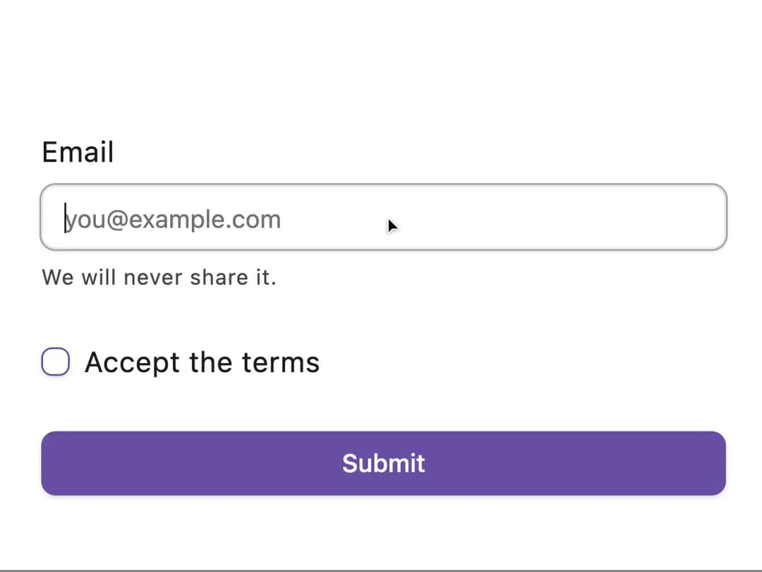
A set of composable form-field layout primitives (label, description, error, group, separator) for building accessible form inputs with Material 3 Expressive styling.
Built with React and Tailwind. Copy the prompt and paste it into Claude Code, Cursor or Lovable: your agent adds Field to your project and fits it to your theme.
Code
How Field is used: the demo's code. The component's own source comes with a free account.
Usage.tsx
import { Button } from "@/components/ui/button";
import { Checkbox } from "@/components/ui/checkbox";
import {
  Field,
  FieldDescription,
  FieldGroup,
  FieldLabel,
} from "@/components/ui/field";
import { Input } from "@/components/ui/input";

export default function Demo() {
  return (
    <form
      className="w-full max-w-sm shrink-0"
      onSubmit={(e) => e.preventDefault()}
    >
      <FieldGroup>
        <Field>
          <FieldLabel htmlFor="field-email">Email</FieldLabel>
          <Input id="field-email" type="email" placeholder="you@example.com" />
          <FieldDescription>We will never share it.</FieldDescription>
        </Field>
        <Field orientation="horizontal">
          <Checkbox id="field-terms" />
          <FieldLabel htmlFor="field-terms">Accept the terms</FieldLabel>
        </Field>
        <Button type="submit">Submit</Button>
      </FieldGroup>
    </form>
  );
}
Dependencies
More by crysta1221
View all
Attachment
21
M3 Expressive Button
20
Input OTP
List Item
Circular Progress
Empty
More in Forms
View all

Login 1
64

Premium Auth
571

Contact Card
1.1K

Form
18

Book A Demo 1
91
Authentication Card
52

Card Studio
47

Login Card
35
