
About
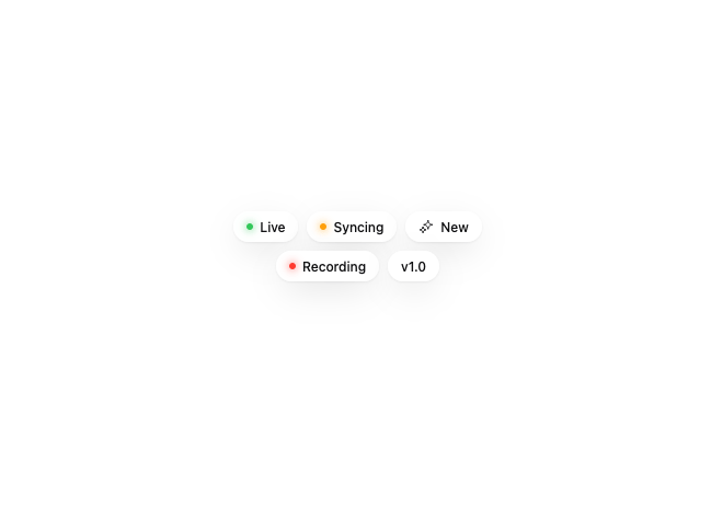
A small glass-effect badge chip for showing a status label with an optional glowing status dot.
Built with React and Tailwind. Copy the prompt and paste it into Claude Code, Cursor or Lovable: your agent adds Glass Badge to your project and fits it to your theme.
Code
How Glass Badge is used: the demo's code. The component's own source comes with a free account.
Usage.tsx
"use client";

import { GlassBadge } from "@/components/ui/glass-badge";
import { HugeiconsIcon } from "@hugeicons/react";
import { SparklesIcon } from "@hugeicons/core-free-icons";

export default function GlassBadgeDemo() {
  return (
    <div className="flex max-w-[280px] flex-wrap items-center justify-center gap-2">
      <GlassBadge dot="#34c759">Live</GlassBadge>
      <GlassBadge dot="#ff9f0a">Syncing</GlassBadge>
      <GlassBadge>
        <HugeiconsIcon icon={SparklesIcon} /> New
      </GlassBadge>
      <GlassBadge dot="#ff3b30">Recording</GlassBadge>
      <GlassBadge>v1.0</GlassBadge>
    </div>
  );
}