
About
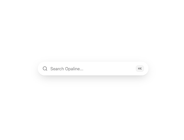
A pill-shaped liquid-glass text input with slots for a leading icon and a trailing adornment, built for search bars and capsule forms.
Built with React and Tailwind. Copy the prompt and paste it into Claude Code, Cursor or Lovable: your agent adds Glass Input to your project and fits it to your theme.
Code
How Glass Input is used: the demo's code. The component's own source comes with a free account.
Usage.tsx
"use client";

import GlassInput from "@/components/ui/glass-input";
import { Search } from "lucide-react";

export default function GlassInputDemo() {
  return (
    <div className="flex min-h-[220px] w-full items-center justify-center bg-background p-10">
      <GlassInput
        type="search"
        placeholder="Search Opaline..."
        startIcon={<Search />}
        endAdornment={
          <kbd className="rounded-md border border-border/60 bg-muted px-1.5 py-0.5 text-[11px] font-medium text-muted-foreground">
            ⌘K
          </kbd>
        }
        className="max-w-sm"
      />
    </div>
  );
}
Dependencies
More by deepraj21
View all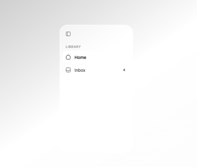
Glass Sidebar
32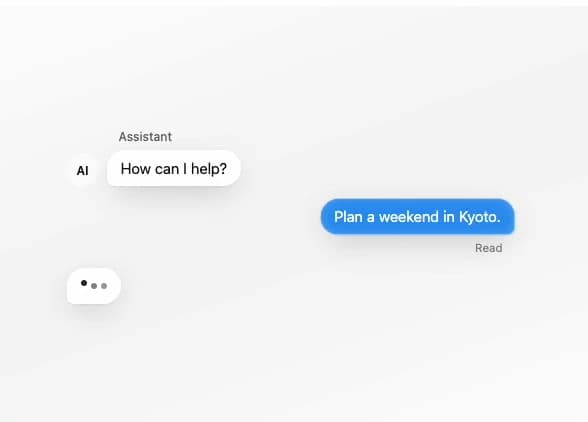
Glass Message
25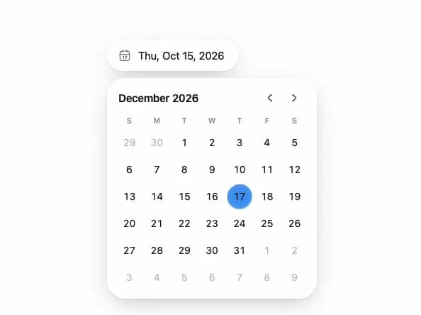
Glass Date Picker
15
Glass Tab Bar
13
Glass QR Code
8
Glass Terminal
7
Glass Select
7
Glass Notification
6
More in Forms
View all

Premium Auth
567

Login 2
12

Form
139

Book A Demo 1
90
Authentication Card
51

Contact Card
1.1K

Card Studio
46

Login 1
62
