
About
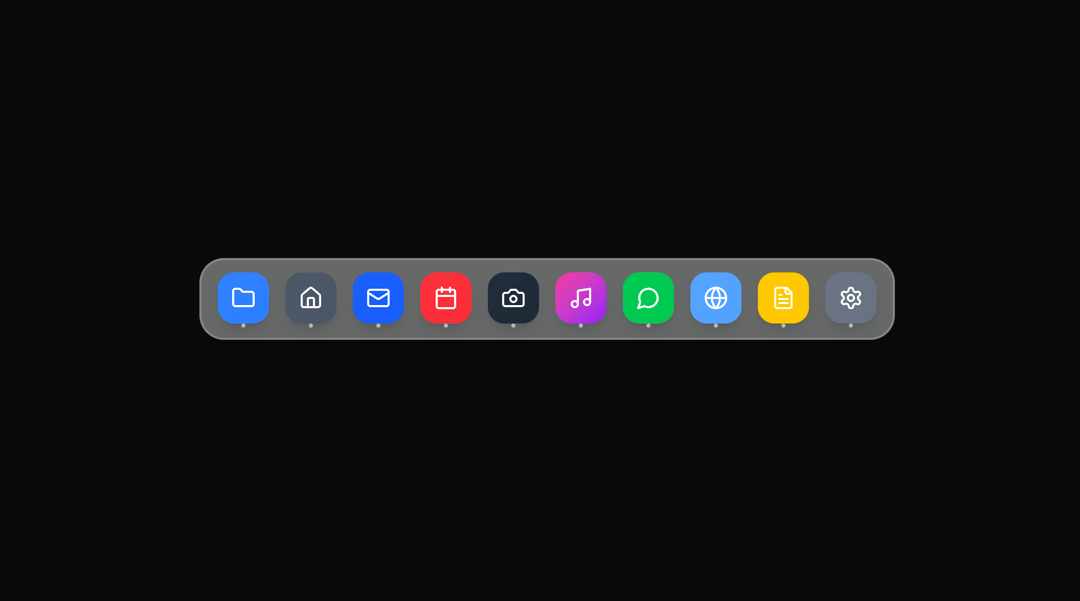
The component includes 10 sample app icons with different colors and uses Lucide React icons. You can easily customize the dock items, colors, and animation parameters to match your needs.
Built with React and Tailwind. Copy the prompt and paste it into Claude Code, Cursor or Lovable: your agent adds Dock Tabs to your project and fits it to your theme.
Code
How Dock Tabs is used: the demo's code. The component's own source comes with a free account.
Usage.tsx
import { DockTabs } from "@/components/ui/dock-tabs";

export default function DemoOne() {
  return <DockTabs />;
}
Dependencies
More by Ali Imam
View all

Liquid Glass Button
7K
Shader Animation
3.9K
WebGL Shader
2.7K
Shader Lines
2.4K
Shiny Button
2.4K
GLSL Hills
2.2K
Canvas
1.8K
Gallery
1.5K
More in Buttons
View all
Texture Button
105
Button
12

Notification Button
115

HeroUI Button Group
2
Button
78

App Store Button
481
Split Button
16
Button Group
14


