
About
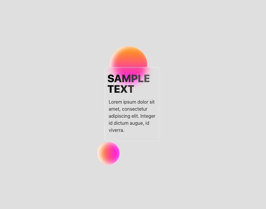
A small glassmorphism card with gradient orbs, animated shine, and gradient‑clipped headline text—great for hero fillers or minimal dashboards.
Built with React and Tailwind. Copy the prompt and paste it into Claude Code, Cursor or Lovable: your agent adds Glass Shine Card to your project and fits it to your theme.
Code
How Glass Shine Card is used: the demo's code. The component's own source comes with a free account.
Usage.tsx
import { SampleCard } from "@/components/ui/glass-shine-card";

export default function DemoOne() {
  return (
    <div className="App">
      <SampleCard />
    </div>
  );
}
More by Dhileep Kumar GM
View all

Aether Flow Hero
1.9K
Woven Light Hero
1.5K
AnomalousMatterHero
1.5K
PulseFit hero
919
Mountain Scene
858
HolographicCard
818
3D Animation
758
Cybernetic Bento Grid
556
More in Cards
View all
Stats cards with links
120

Course Design Cards
1.1K

Statistics Card 2
258
Card
55

Card Studio
9
Statistics Card 7
288
The Item one
3

Weather Card
52
