
About
A hover/focus-activated tooltip that wraps any trigger element, auto-positions on top/bottom/left/right, and flips itself when it would render off-screen.
Built with React and Tailwind. Copy the prompt and paste it into Claude Code, Cursor or Lovable: your agent adds Tooltip to your project and fits it to your theme.
Code
How Tooltip is used: the demo's code. The component's own source comes with a free account.
Usage.tsx
import { Tooltip } from "@/components/ui/tooltip";

export default function TooltipLongContentDemo() {
  return (
    <div style={{ display: "grid", placeItems: "center", minHeight: 200 }}>
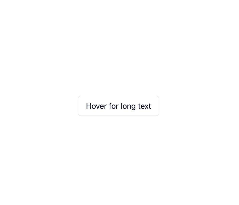
      <Tooltip content="This tooltip has a much longer body of text that wraps onto multiple lines when it exceeds the max-width of the tooltip container.">
        <button
          style={{
            padding: "8px 16px",
            borderRadius: 6,
            border: "1px solid #e2e8f0",
            background: "#fff",
            color: "#0f172a",
            cursor: "pointer",
            fontFamily: "inherit",
          }}
        >
          Hover for long text
        </button>
      </Tooltip>
    </div>
  );
}
More by dixant
View all
Pagination

Skeleton

Radio Group

Icon