
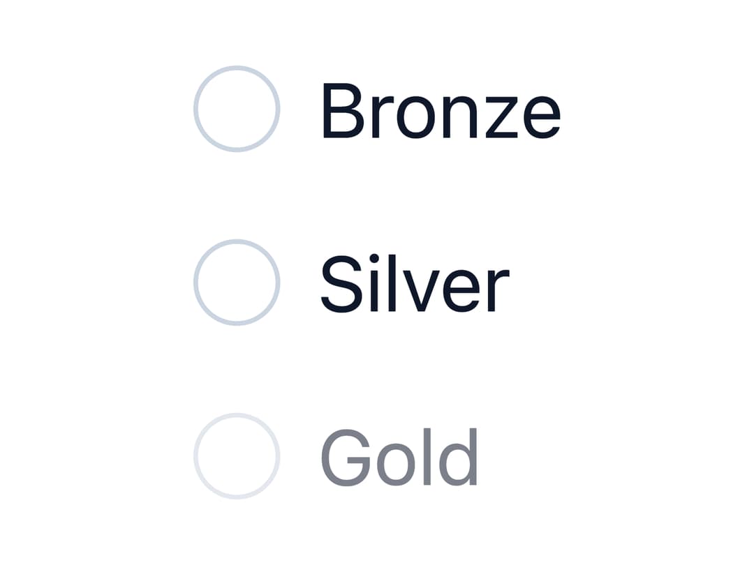
About
An accessible radio button group for choosing one option from a small set, with keyboard arrow navigation and horizontal or vertical layout.
Built with React and Tailwind. Copy the prompt and paste it into Claude Code, Cursor or Lovable: your agent adds Radio Group to your project and fits it to your theme.
Code
How Radio Group is used: the demo's code. The component's own source comes with a free account.
Usage.tsx
import { RadioGroup, RadioButton } from "@/components/ui/radio";

export default function DisabledRadioDemo() {
  return (
    <RadioGroup name="tier" label="Tier">
      <RadioButton value="bronze" label="Bronze" />
      <RadioButton value="silver" label="Silver" />
      <RadioButton value="gold" label="Gold" disabled />
    </RadioGroup>
  );
}
More by dixant
View all
Tooltip
Pagination

Skeleton

Icon
More in Forms
View all

Premium Auth
562

Book A Demo 1
90
Book A Demo 3
101

Contact Card
1.1K

Card Studio
46

Form
139
Authentication Card
51

Form
3
