
About
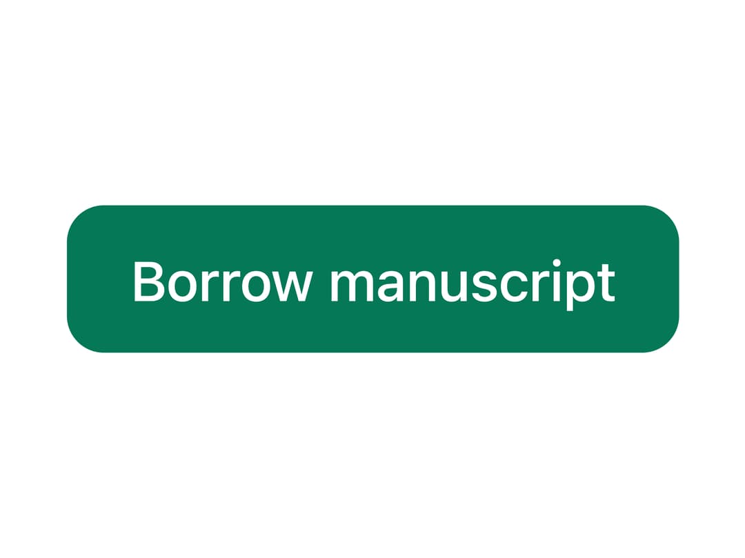
A versatile button (and link-styled anchor) with primary, secondary, ghost, danger and link variants, three sizes, a loading spinner state and a square icon-only mode, ported to React from Sina UI's Svelte Button by ebnsina.
Built with React and Tailwind. Copy the prompt and paste it into Claude Code, Cursor or Lovable: your agent adds Button to your project and fits it to your theme.
Code
How Button is used: the demo's code. The component's own source comes with a free account.
Usage.tsx
import Button from "@/components/ui/button";

export default function ButtonDemo() {
  return (
    <div className="flex items-center justify-center p-10">
      <Button>Borrow manuscript</Button>
    </div>
  );
}
More by ebnsina
View all
Countdown Timer
20
Video Player
15
Alarm Clock
15
Voice Note
12
Split Button
11
Sortable List
10
Stopwatch
5
Code Block
5
More in Buttons
View all

Button
14
Button
34
Texture Button
92
Button Save
46

Button
64

Button Group
3

App Store Button
454

Notification Button
103

