
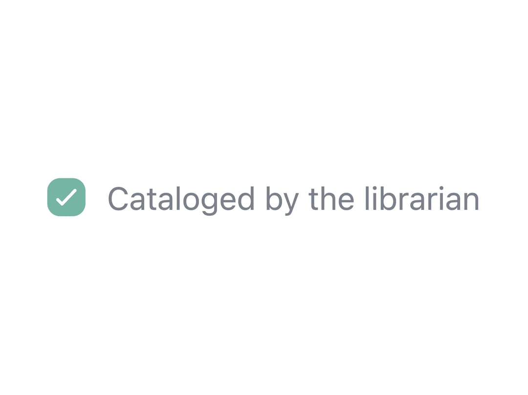
About
An accessible checkbox input with a label, optional hint/error text, and an indeterminate "select all" state for parent/child selections in forms.
Built with React and Tailwind. Copy the prompt and paste it into Claude Code, Cursor or Lovable: your agent adds Checkbox to your project and fits it to your theme.
Code
How Checkbox is used: the demo's code. The component's own source comes with a free account.
Usage.tsx
import Checkbox from "@/components/ui/checkbox";

export default function CheckboxDisabledCheckedDemo() {
  return (
    <Checkbox disabled checked>
      Cataloged by the librarian
    </Checkbox>
  );
}
Dependencies
More by ebnsina
View all
Countdown Timer
29
Video Player
21
Alarm Clock
20
Voice Note
13
Split Button
11
Sortable List
11
Code Block
8
Sign In Auth Card
7
More in Forms
View all

Premium Auth
533

Contact Card
1K

Book A Demo 1
77

Card Studio
44

Login 2
9
Login Card
29

Form
17

Split Sign In Form
77
