
About
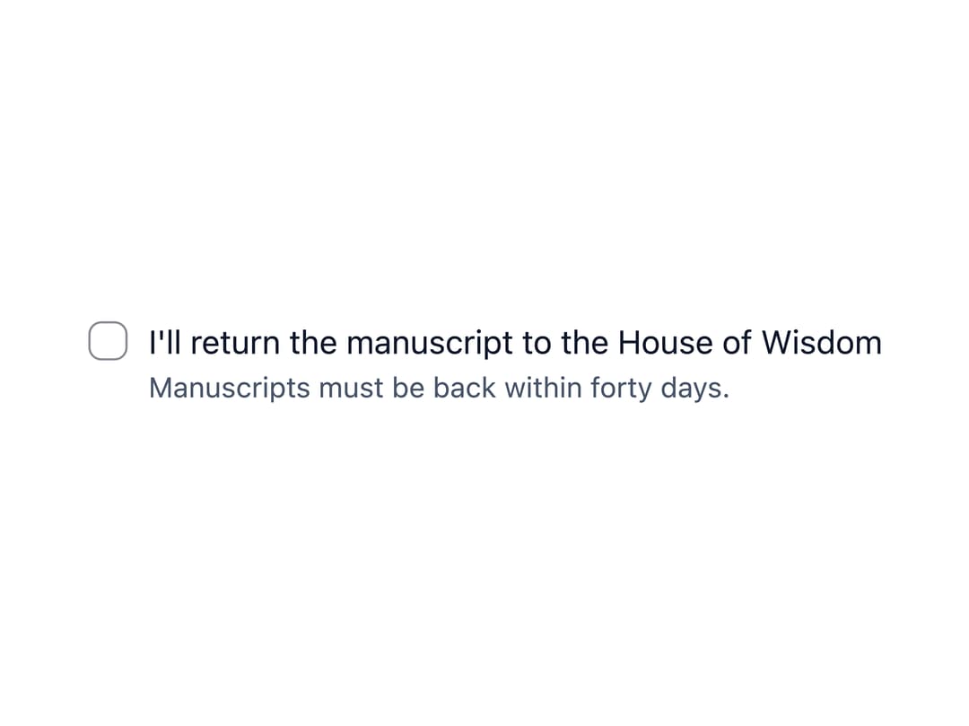
An accessible checkbox input with a label, optional hint/error text, and an indeterminate "select all" state for parent/child selections in forms.
Built with React and Tailwind. Copy the prompt and paste it into Claude Code, Cursor or Lovable: your agent adds Checkbox to your project and fits it to your theme.
Code
How Checkbox is used: the demo's code. The component's own source comes with a free account.
Usage.tsx
"use client";

import * as React from "react";
import Checkbox from "@/components/ui/checkbox";

const initialWorks = [
  { title: "The Canon of Medicine", chosen: true },
  { title: "The Book of Optics", chosen: false },
  { title: "Al-Jabr", chosen: false },
];

export default function CheckboxSelectAllDemo() {
  const [works, setWorks] = React.useState(initialWorks);
  const count = works.filter((w) => w.chosen).length;

  return (
    <div className="grid gap-2">
      <Checkbox
        checked={count === works.length}
        indeterminate={count > 0 && count < works.length}
        onChange={(e) =>
          setWorks((prev) =>
            prev.map((w) => ({ ...w, chosen: e.target.checked })),
          )
        }
      >
        Borrow all works ({count} of {works.length})
      </Checkbox>
      <div className="grid gap-2 pl-7">
        {works.map((work, i) => (
          <Checkbox
            key={work.title}
            checked={work.chosen}
            onChange={(e) =>
              setWorks((prev) =>
                prev.map((w, idx) =>
                  idx === i ? { ...w, chosen: e.target.checked } : w,
                ),
              )
            }
          >
            {work.title}
          </Checkbox>
        ))}
      </div>
    </div>
  );
}
Dependencies
More by ebnsina
View all
Countdown Timer
29
Video Player
21
Alarm Clock
20
Voice Note
13
Split Button
11
Sortable List
11
Sign In Auth Card
8
Code Block
8
More in Forms
View all

Premium Auth
534

Contact Card
1K

Book A Demo 1
78

Card Studio
44

Login 2
9
Login Card
29

Split Sign In Form
78
SignInPage
689

