
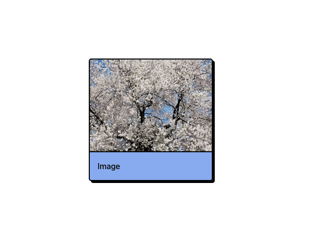
About
Neobrutalism-styled image card component.
Built with React and Tailwind. Copy the prompt and paste it into Claude Code, Cursor or Lovable: your agent adds Image Card to your project and fits it to your theme.
Code
How Image Card is used: the demo's code. The component's own source comes with a free account.
Usage.tsx
import ImageCard from '@/components/ui/image-card'

export const Demo = () => (
    <ImageCard
        caption="Image"
        imageUrl="https://cdn.21st.dev/assets/mirror/5f/5f814cd2c9cc52e93e50bd70b6426546f9c555ff0302a202ff39019c521a4fd4.jpg"
    ></ImageCard>
)More by Samuel Breznjak
View all
Accordion
226
Button
184
Marquee
22
Slider
18
Alert
18
Pagination
17
Checkbox
9
Input
9
More in Cards
View all

Course Design Cards
1.3K

Statistics Card 7
332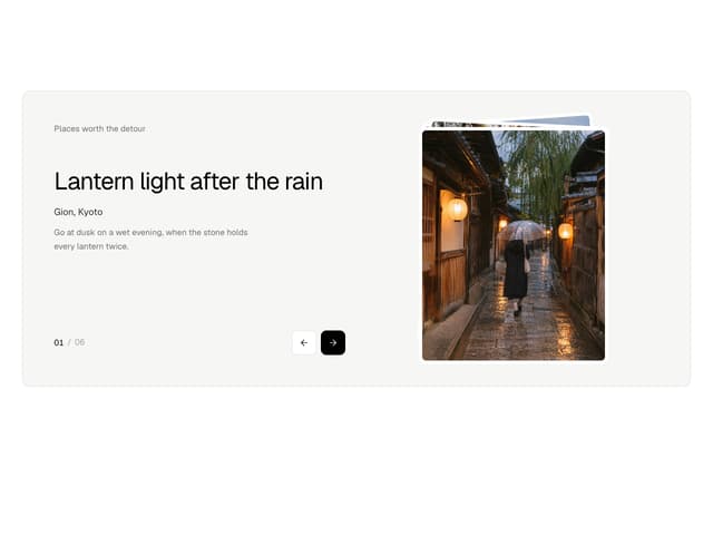

Photo Deck
14

Interactive Tech Stack Bento Grid with Hover Effects
651
Card
73

Card Studio
12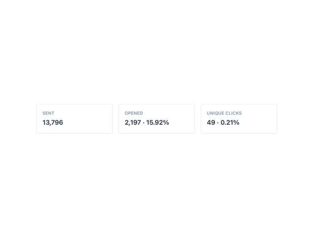
Card

Statistics Card 10
299
