
About
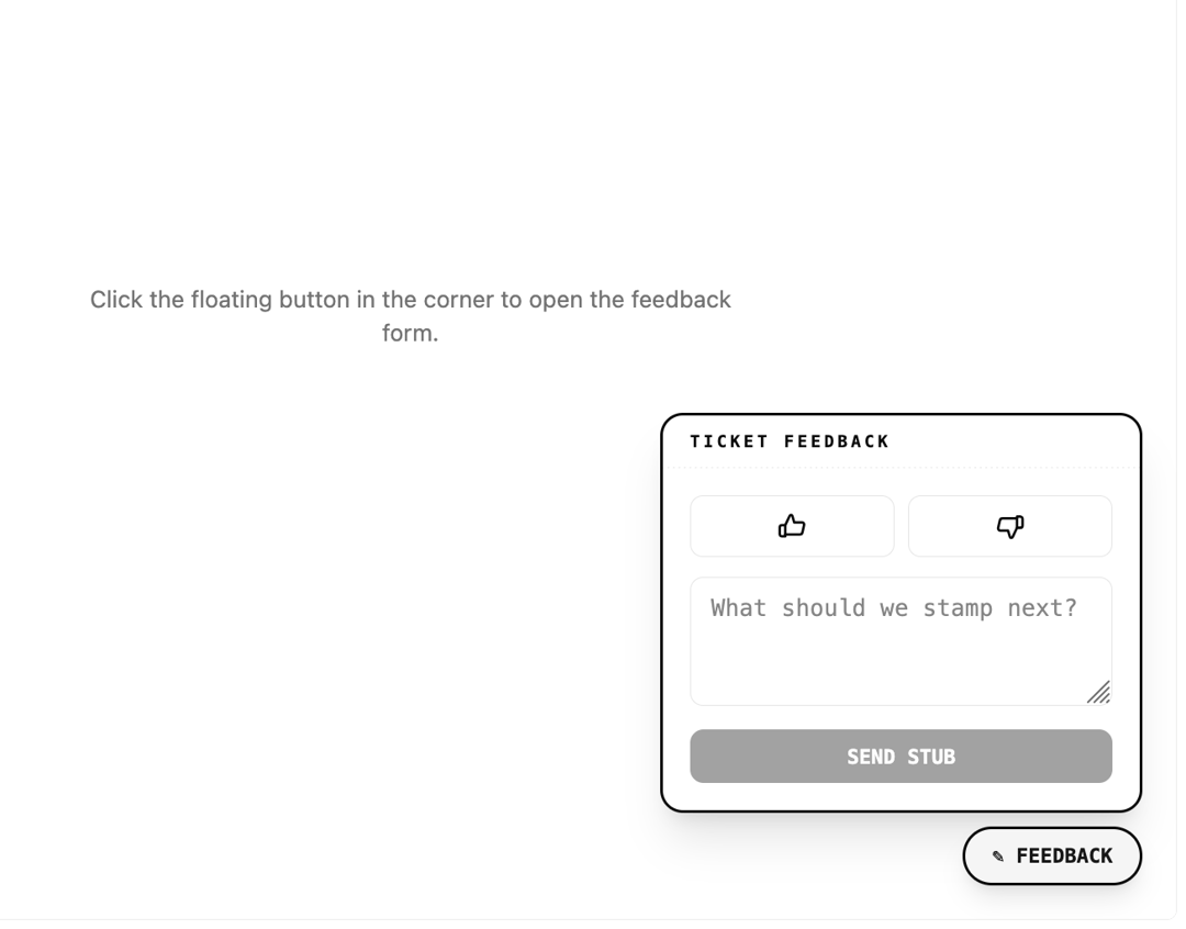
A floating corner button that opens a compact feedback form for capturing a quick good/bad mood rating and an optional message.
Built with React and Tailwind. Copy the prompt and paste it into Claude Code, Cursor or Lovable: your agent adds Feedback Widget to your project and fits it to your theme.
Code
How Feedback Widget is used: the demo's code. The component's own source comes with a free account.
Usage.tsx
import { FeedbackWidget } from "@/components/ui/feedback-widget";

export default function FeedbackWidgetDemo() {
  return (
    <div className="relative flex h-screen w-full items-center justify-center bg-background text-foreground">
      <p className="max-w-sm text-center text-sm text-muted-foreground">
        Click the floating button in the corner to open the feedback form.
      </p>
      <FeedbackWidget
        onSubmit={(message, mood) => {
          console.log("feedback submitted", { message, mood });
        }}
      />
    </div>
  );
}
More by f0rextasy
View all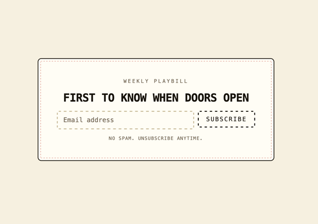
Newsletter Signup Card
16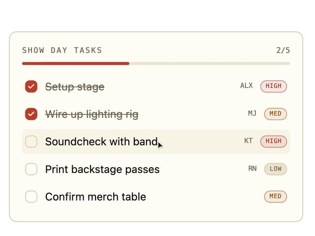
Board Checklist
15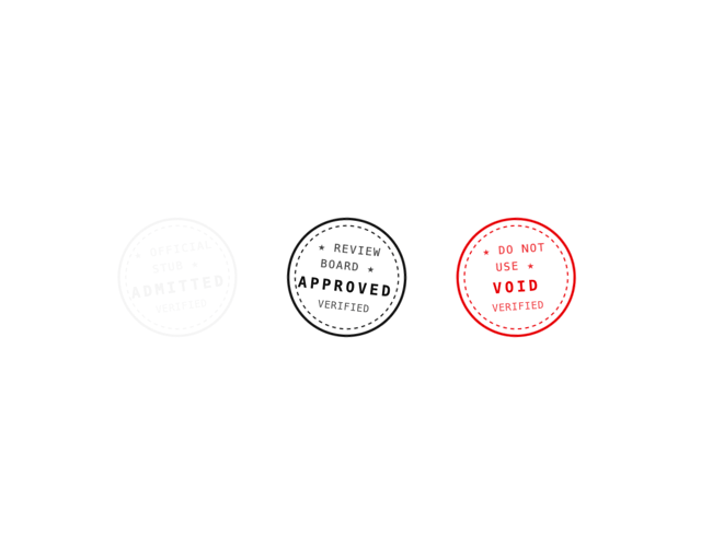
Stamp Seal
12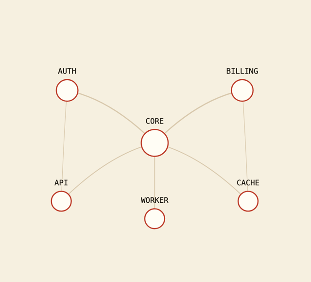
Network Graph
12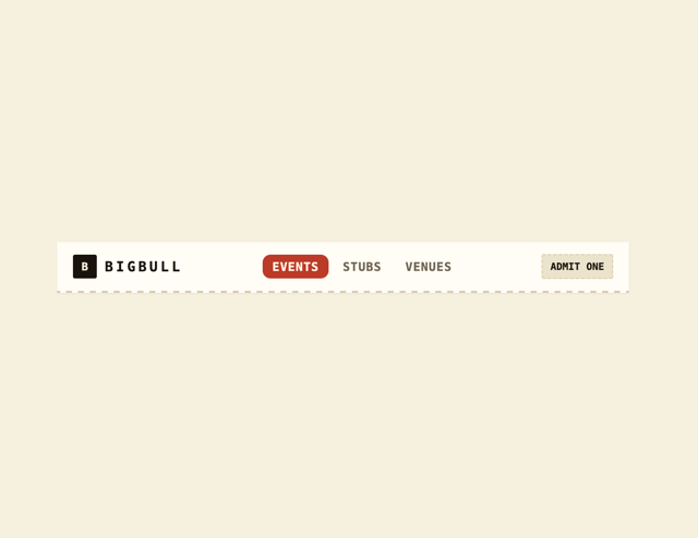
Navbar
8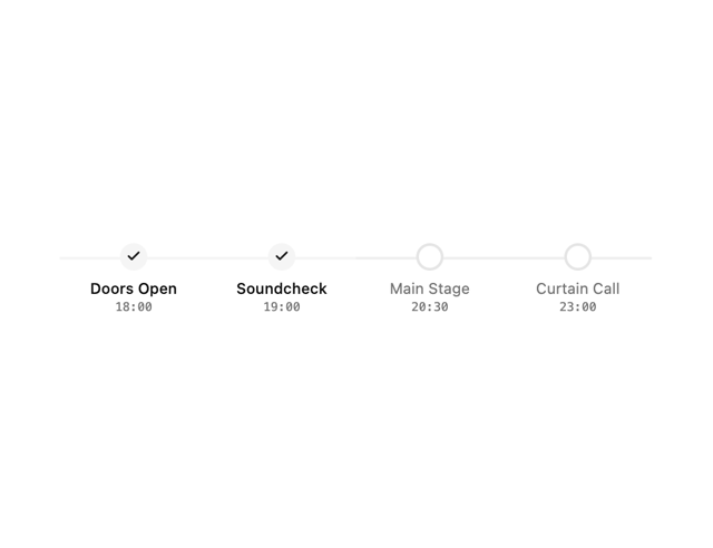
Milestone Chart
7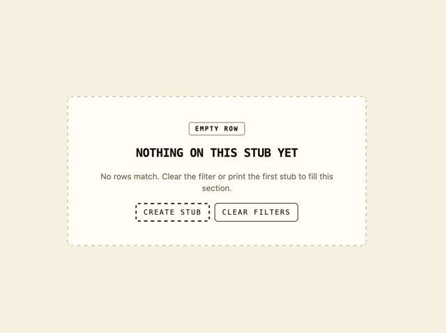
Empty State Card
6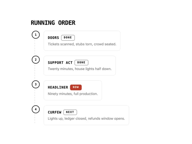
Running Order Timeline
6
More in Forms
View all

Contact Card
1.1K

Premium Auth
551

Login 1
60

Form
17

Form
16

Book A Demo 1
84

Card Studio
46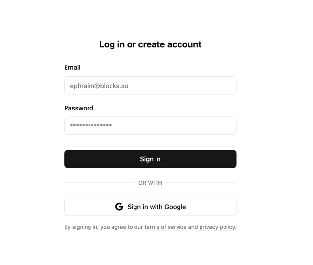

Login 2
10