
About
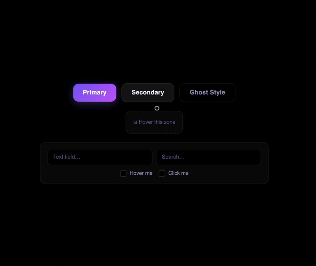
A custom canvas cursor that sends expanding concentric ripple rings outward on every click inside a container, like a stone dropped in still water.
Built with React and Tailwind. Copy the prompt and paste it into Claude Code, Cursor or Lovable: your agent adds Ripple Wave Cursor to your project and fits it to your theme.
Code
How Ripple Wave Cursor is used: the demo's code. The component's own source comes with a free account.
Usage.tsx
"use client";

import RippleWaveCursor from "@/components/ui/ripple-wave-cursor";
import { useRef } from "react";

export default function RippleWaveCursorDemo() {
  const containerRef = useRef<HTMLDivElement>(null);

  return (
    <div
      ref={containerRef}
      className="demo-canvas-area w-full h-screen"
      style={{ cursor: "none", position: "relative", overflow: "hidden" }}
    >
      <RippleWaveCursor
        containerRef={containerRef}
        config={{
          hue: 220,
          speed: 3.2,
          count: 3,
          pointerAnim: true,
          pointerBreathMult: 1.6,
          clickAnim: true,
        }}
      />

      <div className="demo-buttons">
        <button className="btn btn-primary">Primary</button>
        <button className="btn btn-secondary">Secondary</button>
        <button className="btn btn-ghost">Ghost Style</button>
      </div>

      <div className="demo-drag-zone">⊞ Hover this zone</div>

      <div className="demo-input-section">
        <div className="demo-input-row">
          <div className="demo-input-wrap">
            <input
              type="text"
              className="demo-field"
              placeholder="Text field…"
              spellCheck={false}
            />
          </div>
          <div className="demo-input-wrap">
            <input type="search" className="demo-field" placeholder="Search…" />
          </div>
        </div>
        <div className="demo-check-row">
          <label className="demo-check-label">
            <input type="checkbox" className="demo-check" />
            <span className="demo-check-box" />
            <span>Hover me</span>
          </label>
          <label className="demo-check-label">
            <input type="checkbox" className="demo-check" />
            <span className="demo-check-box" />
            <span>Click me</span>
          </label>
        </div>
      </div>
    </div>
  );
}
More by felix-au
View all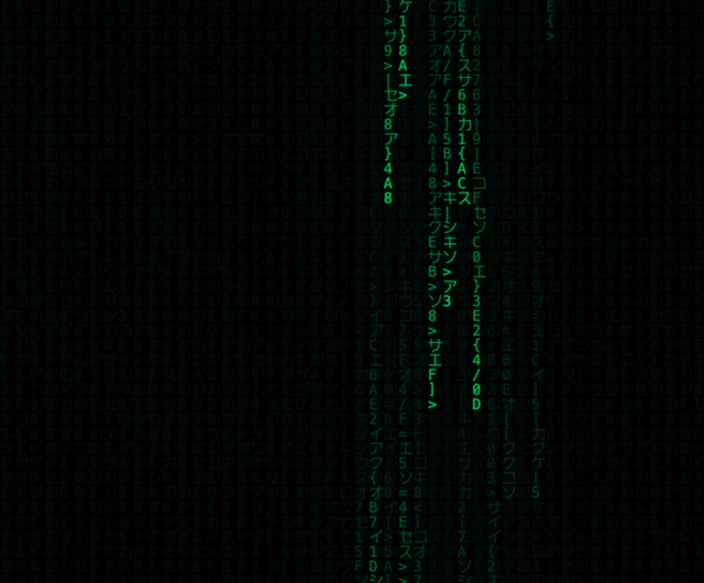
Matrix Rain Cursor
34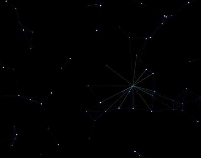
Constellation Cursor
13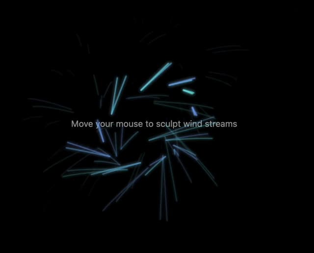
Wind Stream Cursor
5
DNA Helix Cursor
5
Rainbow Comet Cursor
5
Pixel Shatter Cursor
2
Bubble Float Cursor
2
Neon Glow Cursor