
About
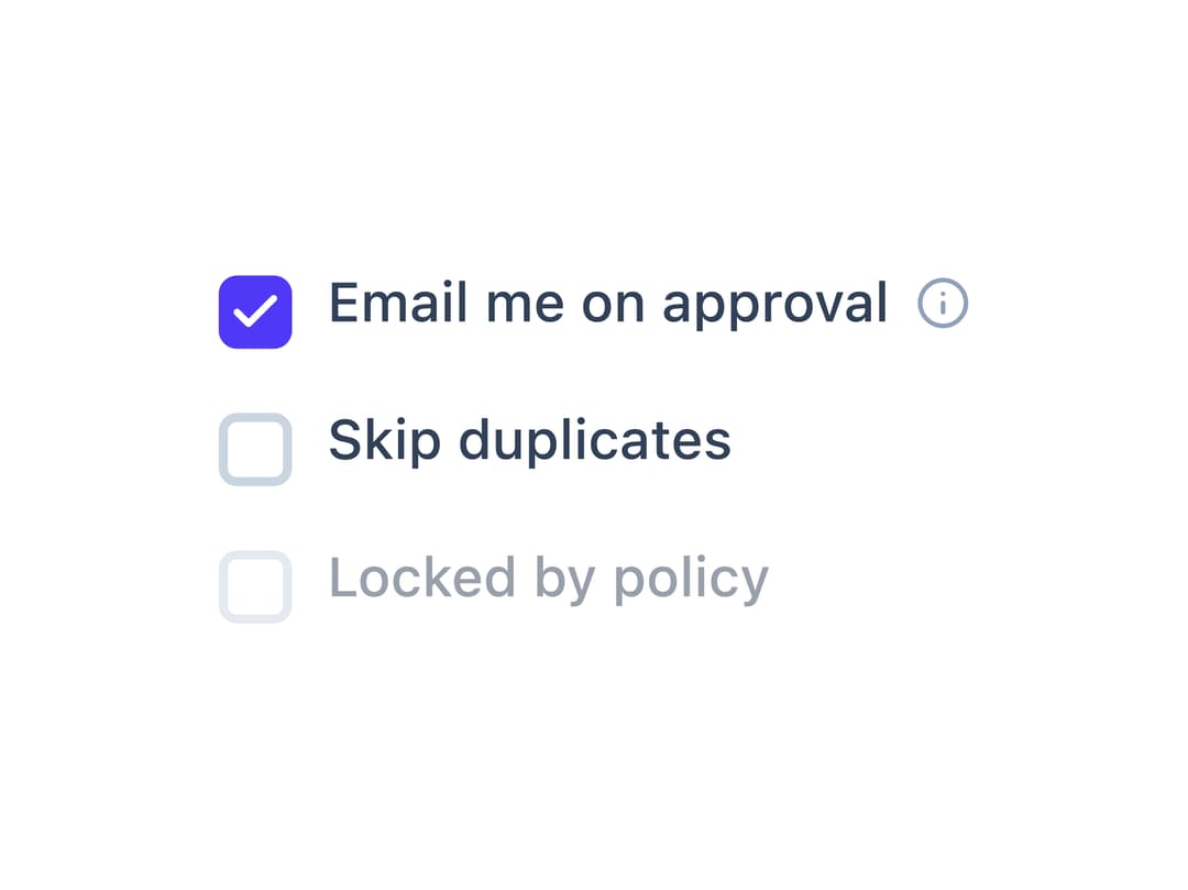
A styled checkbox with a real underlying input, a wrapping label, and an optional info-tooltip hint shown beside the label instead of as a second line of text.
Built with React and Tailwind. Copy the prompt and paste it into Claude Code, Cursor or Lovable: your agent adds Checkbox to your project and fits it to your theme.
Code
How Checkbox is used: the demo's code. The component's own source comes with a free account.
Usage.tsx
"use client";

import Checkbox from "@/components/ui/checkbox";
import { useState } from "react";

export default function CheckboxDemo() {
  const [approval, setApproval] = useState(true);
  const [skipDupes, setSkipDupes] = useState(false);
  const [locked, setLocked] = useState(false);

  return (
    <div className="flex flex-col gap-3 bg-background text-foreground p-6 rounded-xl">
      <Checkbox
        id="cb1"
        checked={approval}
        onChange={setApproval}
        label="Email me on approval"
        hint="One email per batch, not per row."
      />
      <Checkbox
        id="cb2"
        name="skip_dupes"
        checked={skipDupes}
        onChange={setSkipDupes}
        label="Skip duplicates"
      />
      <Checkbox
        id="cb3"
        checked={locked}
        onChange={setLocked}
        label="Locked by policy"
        disabled
      />
    </div>
  );
}
Dependencies
More by haassiib
View all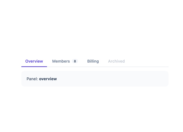
Tabs
9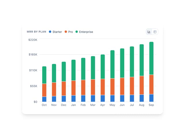
Bar Chart
1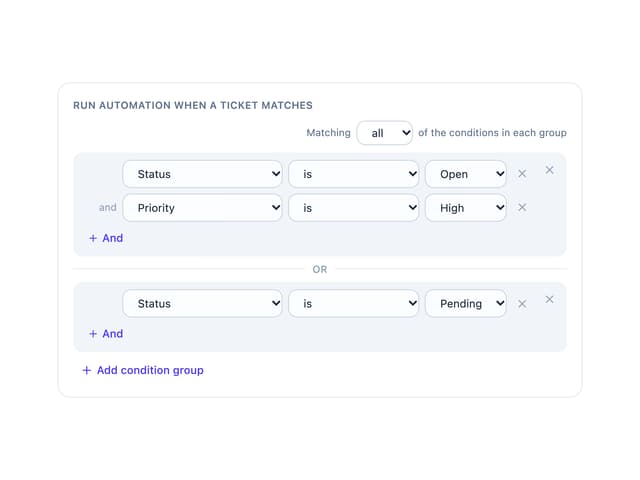
Condition Groups Builder
1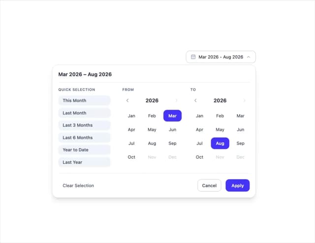
Month Range Picker
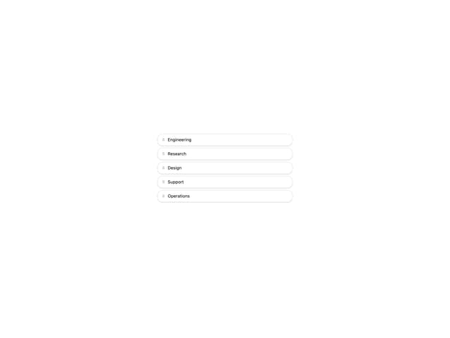
Sortable List
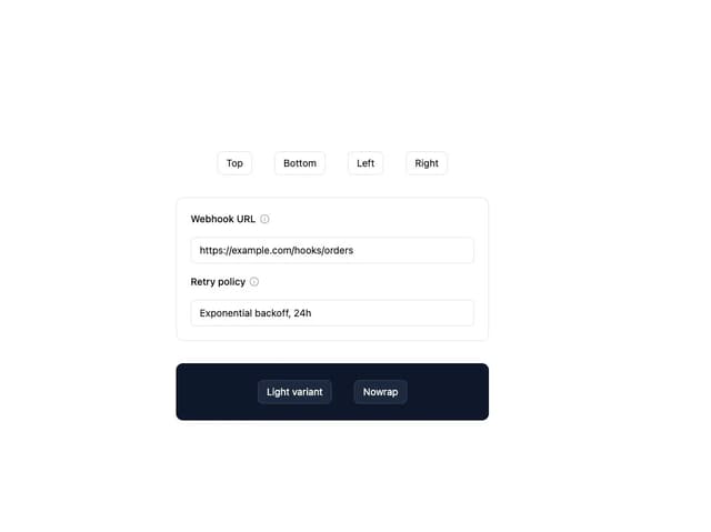
Tooltip
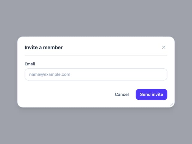
Draggable Resizable Modal
Filter Panel
More in Forms
View all

Premium Auth
496
Authentication Card
44

Login 1
52

Login 2
7

Form
32

Card Studio
41

Form
136

Login Card
32
