
About
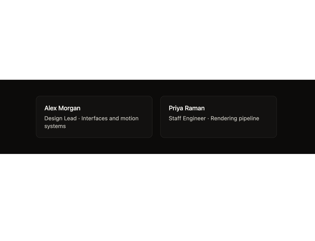
A profile card where hovering sends a swarm of glowing coloured dots traveling around the card's border, usable standalone or as an endless draggable marquee of team members.
Built with React and Tailwind. Copy the prompt and paste it into Claude Code, Cursor or Lovable: your agent adds Orbit Card to your project and fits it to your theme.
Code
How Orbit Card is used: the demo's code. The component's own source comes with a free account.
Usage.tsx
"use client";

import { OrbitCard, type OrbitPerson } from "@/components/ui/orbit-card";

const PEOPLE: OrbitPerson[] = [
  {
    id: "am",
    name: "Alex Morgan",
    role: "Design Lead · Interfaces and motion systems",
    color: "#5C7CFA",
  },
  {
    id: "pr",
    name: "Priya Raman",
    role: "Staff Engineer · Rendering pipeline",
    color: "#EF6FA7",
  },
];

export default function Demo() {
  return (
    <div className="flex min-h-full w-full flex-col justify-center bg-[#0c0b0a] py-10">
      <div className="flex flex-wrap justify-center gap-5 px-6">
        {PEOPLE.map((p) => (
          <OrbitCard key={p.id} person={p} />
        ))}
      </div>
    </div>
  );
}
More by ham7a311
View all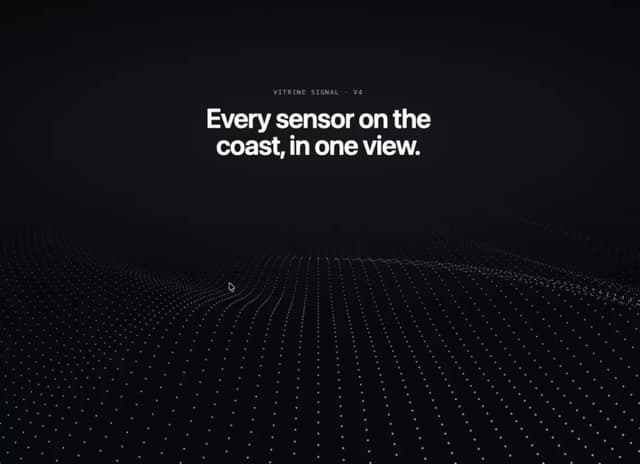
Wave Mesh
146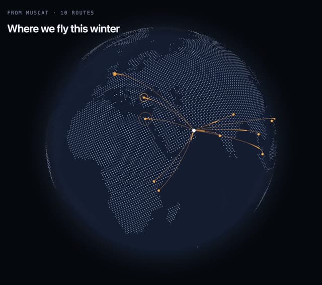
Route Globe
132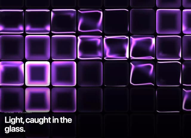
Glass Tiles
116
Glyph Swell
52
Orbit Ring Stats
49
Ask Bar
41
Intent Label
33
Glass Ribbons
30
More in Cards
View all
Stats cards with links
92

Course Design Cards
1.2K

Statistics Card 7
316
Statistics Card 2
295

Interactive Tech Stack Bento Grid with Hover Effects
503
Card
57

Item
10

Card Studio
8
