

About
A toolbar of icon buttons that share a single pointer-tracked spotlight glow lighting up whichever buttons are nearby, with toggleable pressed states for formatting actions.
Built with React and Tailwind. Copy the prompt and paste it into Claude Code, Cursor or Lovable: your agent adds Spotlight Group to your project and fits it to your theme.
Code
How Spotlight Group is used: the demo's code. The component's own source comes with a free account.
Usage.tsx
"use client";

import {
  SpotlightGroup,
  type SpotlightItem,
} from "@/components/ui/spotlight-group";
import { useState } from "react";

const I = (d: string) => (
  <svg viewBox="0 0 20 20">
    <path d={d} />
  </svg>
);
const ITEMS: SpotlightItem[] = [
  {
    id: "bold",
    label: "Bold",
    toggle: true,
    group: 0,
    icon: I("M6 4h5a3 3 0 0 1 0 6H6zM6 10h6a3 3 0 0 1 0 6H6z"),
  },
  {
    id: "italic",
    label: "Italic",
    toggle: true,
    group: 0,
    icon: I("M12 4H8.5M11.5 16H8M11 4 9 16"),
  },
  {
    id: "underline",
    label: "Underline",
    toggle: true,
    group: 0,
    icon: I("M6 4v5a4 4 0 0 0 8 0V4M5 17h10"),
  },
  {
    id: "link",
    label: "Add link",
    group: 1,
    icon: I(
      "M8.5 11.5a3 3 0 0 0 4.2 0l2.6-2.6a3 3 0 0 0-4.2-4.2l-.9.9M11.5 8.5a3 3 0 0 0-4.2 0l-2.6 2.6a3 3 0 0 0 4.2 4.2l.9-.9",
    ),
  },
  {
    id: "quote",
    label: "Quote",
    toggle: true,
    group: 1,
    icon: I(
      "M5 8.5h3V12H5zM5 8.5C5 6.5 6 5 8 4.5M12 8.5h3V12h-3zM12 8.5c0-2 1-3.5 3-4",
    ),
  },
  {
    id: "list",
    label: "Bulleted list",
    toggle: true,
    group: 1,
    icon: I("M8 5.5h8M8 10h8M8 14.5h8M4.5 5.5h.01M4.5 10h.01M4.5 14.5h.01"),
  },
  {
    id: "code",
    label: "Code",
    toggle: true,
    group: 2,
    icon: I("M7.5 6 3.5 10l4 4M12.5 6l4 4-4 4"),
  },
  {
    id: "image",
    label: "Insert image",
    group: 2,
    icon: I("M3.5 5.5h13v9h-13zM3.5 12.5l3.5-3 3 2.5 2.5-2 4 3.5M13 8h.01"),
  },
];

export default function Demo() {
  const [last, setLast] = useState("");
  return (
    <div className="flex min-h-screen w-full items-center justify-center p-6 bg-[#0b0a0d]">
      <div className="flex w-full max-w-[34rem] flex-col items-center gap-5">
        <SpotlightGroup
          theme="night"
          label="Formatting"
          items={ITEMS}
          defaultPressed={["bold"]}
          onToggle={(id, on) =>
            setLast(
              `${ITEMS.find((x) => x.id === id)!.label} ${on ? "on" : "off"}`,
            )
          }
          onAction={(id) => setLast(ITEMS.find((x) => x.id === id)!.label)}
        />
        <p className="text-center text-[0.875rem] leading-relaxed text-[#9c96a1]">
          <span className="font-semibold text-[#efe8dc]">
            Trip notes: Wahiba Sands.
          </span>{" "}
          Leave Muscat by 6am, fuel up in Bidiyah, let the tyres down before the
          first dune.
        </p>
        <p
          className="font-mono text-[0.6875rem] uppercase tracking-[0.14em] text-[#9c96a1]"
          aria-live="polite"
        >
          {last || "Move across the toolbar"}
        </p>
      </div>
    </div>
  );
}
More by ham7a311
View all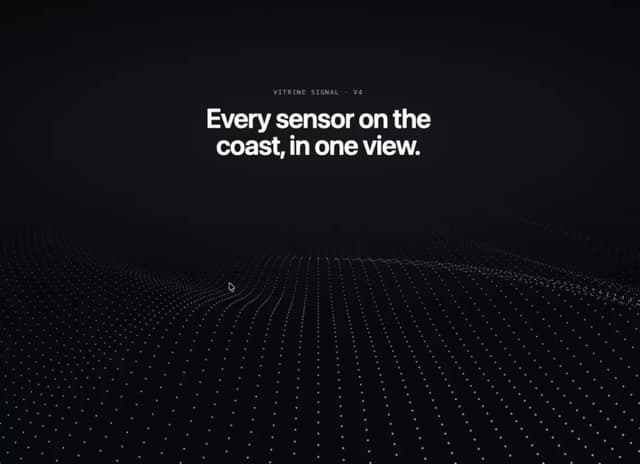
Wave Mesh
139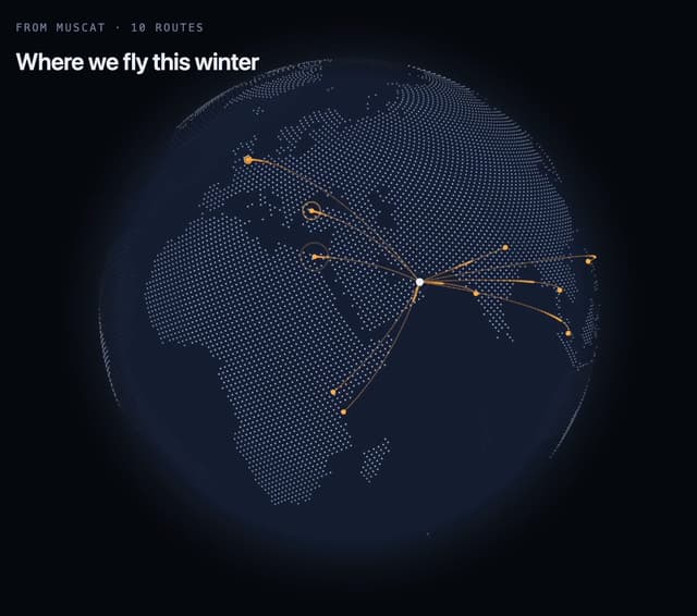
Route Globe
129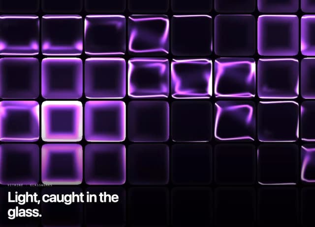
Glass Tiles
109
Glyph Swell
50
Orbit Ring Stats
48
Ask Bar
39
Intent Label
31
Glass Ribbons
30
More in Buttons
View all
Button
10

Button
1

Eclipse Button
3
Texture Button
101
Native Button
12

App Store Button
472

Button Group
3
Base Button
1


