
About
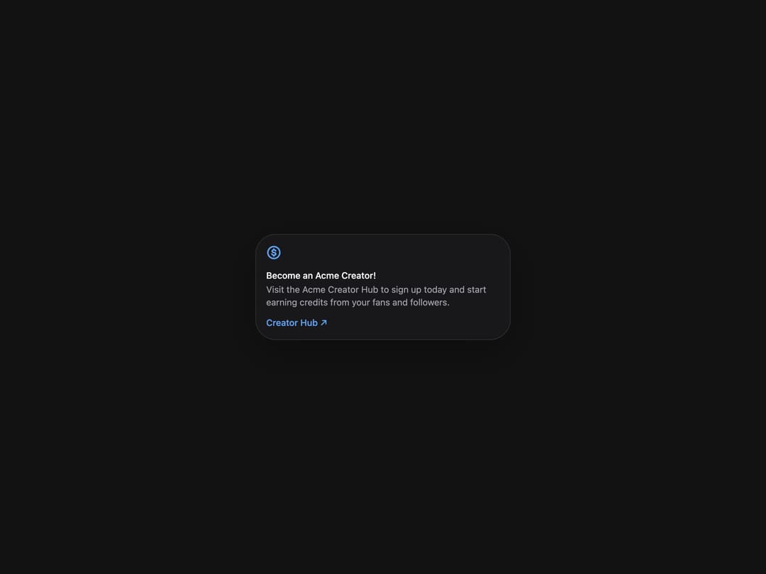
Flexible container component for grouping related content and actions.
Built with React and Tailwind. Copy the prompt and paste it into Claude Code, Cursor or Lovable: your agent adds Card to your project and fits it to your theme.
Code
How Card is used: the demo's code. The component's own source comes with a free account.
Usage.tsx
import { Card } from "@/components/ui/heroui-card";

function CircleDollarIcon() {
  return (
    <svg
      aria-label="Dollar sign icon"
      className="size-6 text-blue-600 dark:text-blue-400"
      fill="none"
      role="img"
      viewBox="0 0 16 16"
      xmlns="http://www.w3.org/2000/svg"
    >
      <path
        clipRule="evenodd"
        d="M13.5 8a5.5 5.5 0 1 1-11 0 5.5 5.5 0 0 1 11 0M15 8A7 7 0 1 1 1 8a7 7 0 0 1 14 0M8.75 4.25a.75.75 0 0 0-1.5 0v.339a2.5 2.5 0 0 0-1.007.47 1.95 1.95 0 0 0-.74 1.546c0 .764.474 1.265.94 1.559.456.287 1.007.448 1.448.547.462.102.843.191 1.118.341.228.125.275.224.275.376 0 .102-.04.217-.248.341-.224.135-.577.229-.982.229-.344 0-.683-.114-.953-.29-.281-.184-.42-.388-.457-.506a.75.75 0 1 0-1.43.452c.171.543.591 1 1.068 1.31.284.185.612.335.968.429v.357a.75.75 0 0 0 1.5 0v-.313c.375-.067.74-.19 1.058-.382.53-.319.976-.864.976-1.627 0-.864-.51-1.394-1.055-1.692-.478-.26-1.056-.389-1.46-.478l-.053-.012c-.386-.086-.736-.202-.973-.352-.227-.142-.24-.236-.24-.29a.45.45 0 0 1 .18-.375c.134-.108.403-.227.87-.227.47 0 .742.11.9.218a.83.83 0 0 1 .316.41.75.75 0 0 0 1.407-.52 2.33 2.33 0 0 0-.878-1.13 2.7 2.7 0 0 0-1.048-.417z"
        fill="currentColor"
        fillRule="evenodd"
      />
    </svg>
  );
}

export default function CardDefaultDemo() {
  return (
    <div className="flex min-h-screen w-full items-center justify-center overflow-hidden bg-background p-8">
      <Card className="w-[400px]">
        <CircleDollarIcon />
        <Card.Header>
          <Card.Title>Become an Acme Creator!</Card.Title>
          <Card.Description>
            Visit the Acme Creator Hub to sign up today and start earning credits from your fans and followers.
          </Card.Description>
        </Card.Header>
        <Card.Footer>
          <a className="inline-flex items-center gap-1 text-sm font-medium text-blue-600 dark:text-blue-400" href="https://heroui.com">
            Creator Hub
            <span aria-hidden="true">↗</span>
          </a>
        </Card.Footer>
      </Card>
    </div>
  );
}

export { CardDefaultDemo };
More by Hero Ui
View all

DatePicker
470
Chip
448
The Pagination
365
HeroUI Table
123
HeroUI Color Picker
113
Skeleton
105
HeroUI Disclosure Group
96
HeroUI AlertDialog
82
More in Cards
View all

Course Design Cards
1.3K

Statistics Card 2
304
Stats cards with links
37

Interactive Tech Stack Bento Grid with Hover Effects
601

Card Studio
14
Statistics Card 7
326
The Item one
3
Card
72
