
About
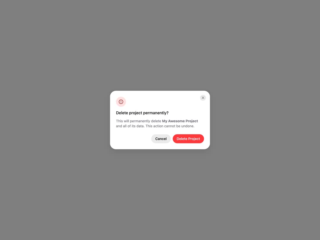
HeroUI AlertDialog for critical confirmations, with status icons, placements, backdrop variants, sizes, custom icons, dismiss behavior, controlled state and custom trigger examples. Uses the real @heroui/react component with bundled @heroui/styles CSS.
Built with React and Tailwind. Copy the prompt and paste it into Claude Code, Cursor or Lovable: your agent adds HeroUI AlertDialog to your project and fits it to your theme.
Code
How HeroUI AlertDialog is used: the demo's code. The component's own source comes with a free account.
Usage.tsx
"use client"

import { AlertDialog } from "@/components/ui/heroui-alert-dialog"
import { Button } from "@heroui/react"

export default function Default() {
  return (
    <AlertDialog>
      <Button variant="danger">Delete Project</Button>
      <AlertDialog.Backdrop>
        <AlertDialog.Container>
          <AlertDialog.Dialog className="sm:max-w-[400px]">
            <AlertDialog.CloseTrigger />
            <AlertDialog.Header>
              <AlertDialog.Icon status="danger" />
              <AlertDialog.Heading>Delete project permanently?</AlertDialog.Heading>
            </AlertDialog.Header>
            <AlertDialog.Body>
              <p>
                This will permanently delete <strong>My Awesome Project</strong> and all of its
                data. This action cannot be undone.
              </p>
            </AlertDialog.Body>
            <AlertDialog.Footer>
              <Button slot="close" variant="tertiary">Cancel</Button>
              <Button slot="close" variant="danger">Delete Project</Button>
            </AlertDialog.Footer>
          </AlertDialog.Dialog>
        </AlertDialog.Container>
      </AlertDialog.Backdrop>
    </AlertDialog>
  )
}
Dependencies
More by Hero Ui
View all

DatePicker
470
Chip
448
The Pagination
365
HeroUI Table
123
HeroUI Color Picker
113
Skeleton
105
HeroUI Disclosure Group
96
ComboBox
75
More in Buttons
View all
Texture Button
105

Notification Button
115

Button
1
HeroUI Button Group

Button
12
Base Button
1

App Store Button
483
Split Button
37


