
About
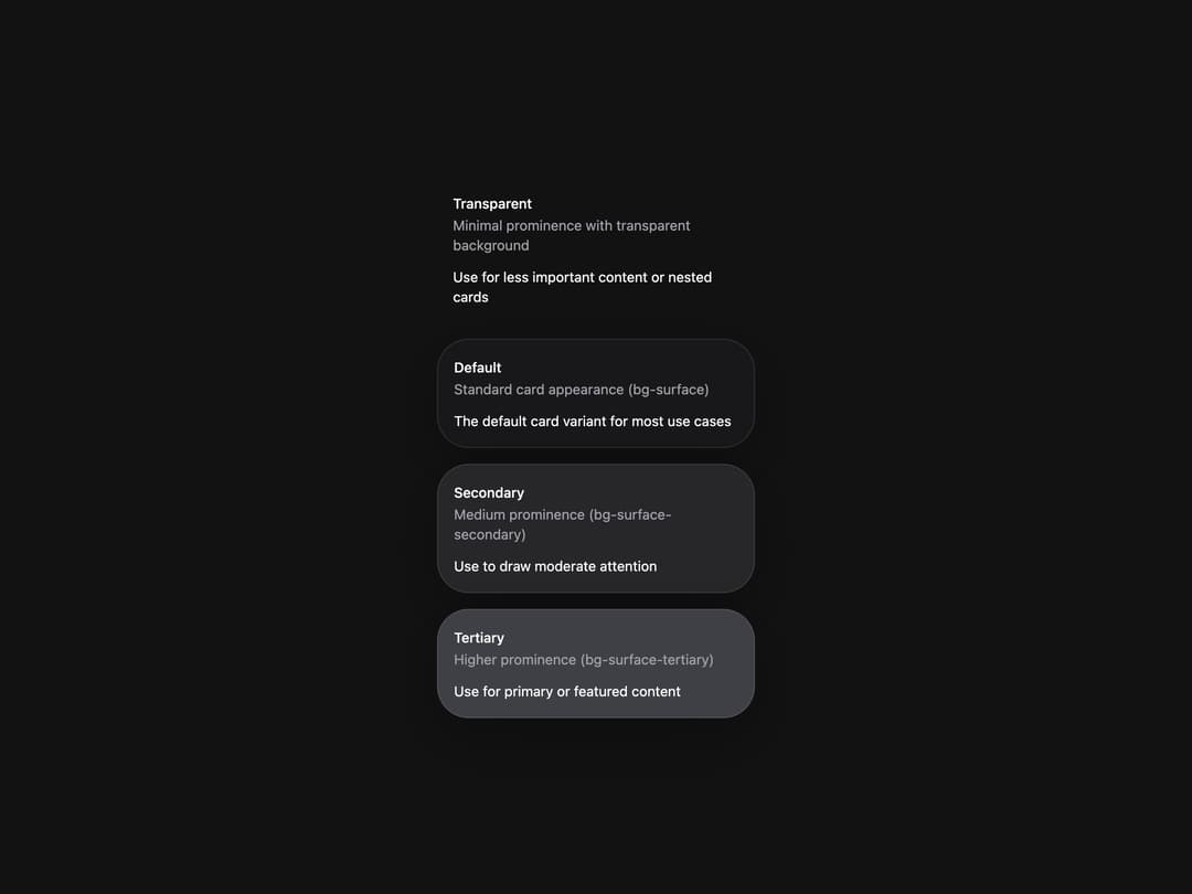
Flexible container component for grouping related content and actions.
Built with React and Tailwind. Copy the prompt and paste it into Claude Code, Cursor or Lovable: your agent adds Card to your project and fits it to your theme.
Code
How Card is used: the demo's code. The component's own source comes with a free account.
Usage.tsx
import { Card } from "@/components/ui/heroui-card";

const cards = [
  {
    variant: "transparent" as const,
    title: "Transparent",
    description: "Minimal prominence with transparent background",
    body: "Use for less important content or nested cards",
  },
  {
    variant: "default" as const,
    title: "Default",
    description: "Standard card appearance (bg-surface)",
    body: "The default card variant for most use cases",
  },
  {
    variant: "secondary" as const,
    title: "Secondary",
    description: "Medium prominence (bg-surface-secondary)",
    body: "Use to draw moderate attention",
  },
  {
    variant: "tertiary" as const,
    title: "Tertiary",
    description: "Higher prominence (bg-surface-tertiary)",
    body: "Use for primary or featured content",
  },
];

export default function CardVariantsDemo() {
  return (
    <div className="flex min-h-screen w-full items-center justify-center overflow-hidden bg-background p-8">
      <div className="flex flex-col gap-4">
        {cards.map((item) => (
          <Card className="w-[320px]" key={item.title} variant={item.variant}>
            <Card.Header>
              <Card.Title>{item.title}</Card.Title>
              <Card.Description>{item.description}</Card.Description>
            </Card.Header>
            <Card.Content>
              <p>{item.body}</p>
            </Card.Content>
          </Card>
        ))}
      </div>
    </div>
  );
}

export { CardVariantsDemo };
More by Hero Ui
View all

DatePicker
468
Chip
443
The Pagination
364
HeroUI Table
114
HeroUI Color Picker
107
Skeleton
105
HeroUI Disclosure Group
95
HeroUI AlertDialog
81
More in Cards
View all

Course Design Cards
1.1K

Interactive Tech Stack Bento Grid with Hover Effects
275

Statistics Card 2
280
Statistics Card 7
302

Card Studio
14
Stats cards with links
125

Weather Card
60
Statistics Card 10
273
