
About
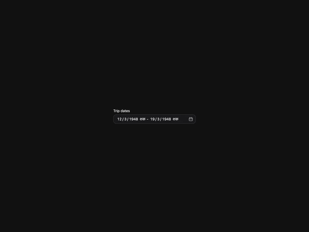
Composable date range picker built on React Aria DateRangePicker with DateField and RangeCalendar composition.
Built with React and Tailwind. Copy the prompt and paste it into Claude Code, Cursor or Lovable: your agent adds DateRangePicker to your project and fits it to your theme.
Code
How DateRangePicker is used: the demo's code. The component's own source comes with a free account.
Usage.tsx
"use client";

import { DateRangePicker } from "@/components/ui/heroui-date-range-picker";

const sakaRange = {
  start: { month: 3, day: 12, year: 1948, era: "शक" },
  end: { month: 3, day: 19, year: 1948, era: "शक" },
};

export default function InternationalCalendarDemo() {
  return (
    <div className="flex min-h-screen w-full items-center justify-center overflow-hidden bg-background p-8">
      <DateRangePicker label="Trip dates" value={sakaRange} international />
    </div>
  );
}

export { InternationalCalendarDemo };
More by Hero Ui
View all

DatePicker
473
Chip
449
The Pagination
367
HeroUI Table
123
HeroUI Color Picker
115
Skeleton
107
HeroUI Disclosure Group
98
HeroUI AlertDialog
85