
About
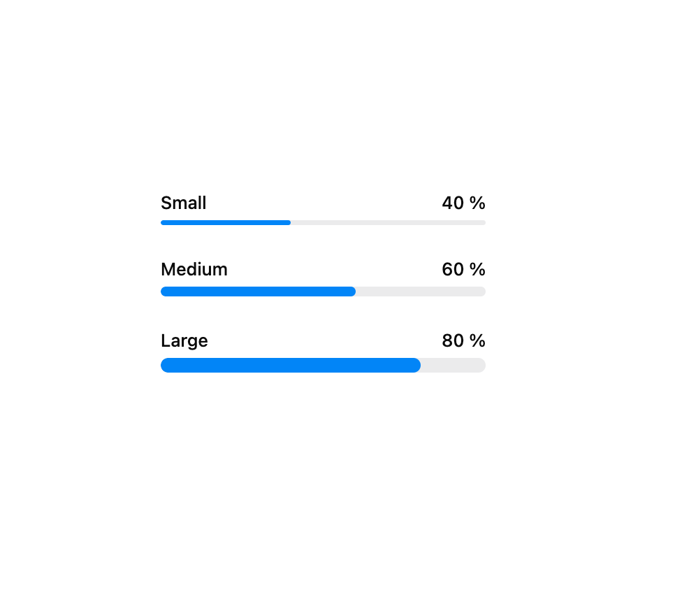
A HeroUI progress bar for showing completion of a task — loading, uploads, multi-step flows. Built on react-aria with an accessible label and formatted output. Supports accent/success/warning/danger colors, sm/md/lg sizes, an indeterminate animated state, and an optional label.
Built with React and Tailwind. Copy the prompt and paste it into Claude Code, Cursor or Lovable: your agent adds Progress Bar to your project and fits it to your theme.
Code
How Progress Bar is used: the demo's code. The component's own source comes with a free account.
Usage.tsx
"use client"

import { ProgressBar } from "@/components/ui/heroui-progress-bar"
import { Label } from "@heroui/react"

export default function Sizes() {
  return (
    <div className="flex w-full items-center justify-center p-10">
      <div className="flex w-64 flex-col gap-6">
        <ProgressBar aria-label="Small" size="sm" value={40} color="accent">
          <Label>Small</Label>
          <ProgressBar.Output />
          <ProgressBar.Track>
            <ProgressBar.Fill />
          </ProgressBar.Track>
        </ProgressBar>
        <ProgressBar aria-label="Medium" size="md" value={60} color="accent">
          <Label>Medium</Label>
          <ProgressBar.Output />
          <ProgressBar.Track>
            <ProgressBar.Fill />
          </ProgressBar.Track>
        </ProgressBar>
        <ProgressBar aria-label="Large" size="lg" value={80} color="accent">
          <Label>Large</Label>
          <ProgressBar.Output />
          <ProgressBar.Track>
            <ProgressBar.Fill />
          </ProgressBar.Track>
        </ProgressBar>
      </div>
    </div>
  )
}
Dependencies
More by Hero Ui
View all

DatePicker
466
Chip
440
The Pagination
361
HeroUI Color Picker
105
Skeleton
104
HeroUI Table
99
HeroUI Disclosure Group
94
HeroUI AlertDialog
79