
About
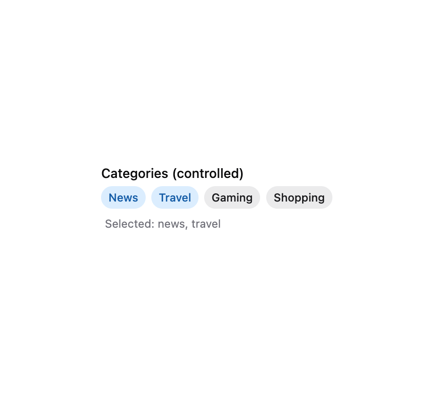
HeroUI v3 TagGroup — selectable tags with sizes, variants, disabled, selection modes, controlled state, error message, prefix, removable tags and list-data management.
Built with React and Tailwind. Copy the prompt and paste it into Claude Code, Cursor or Lovable: your agent adds HeroUI Tag Group to your project and fits it to your theme.
Code
How HeroUI Tag Group is used: the demo's code. The component's own source comes with a free account.
Usage.tsx
"use client"

import type { Key } from "@heroui/react"
import { useState } from "react"
import { Description, Label, Tag, TagGroup } from "@/components/ui/heroui-tag-group"

export default function TagGroupControlled() {
  const [selected, setSelected] = useState<Iterable<Key>>(new Set(["news", "travel"]))

  return (
    <div className="flex flex-col gap-3">
      <TagGroup
        selectedKeys={selected}
        selectionMode="multiple"
        onSelectionChange={(keys) => setSelected(keys)}
      >
        <Label>Categories (controlled)</Label>
        <TagGroup.List>
          <Tag id="news">News</Tag>
          <Tag id="travel">Travel</Tag>
          <Tag id="gaming">Gaming</Tag>
          <Tag id="shopping">Shopping</Tag>
        </TagGroup.List>
        <Description>
          Selected: {Array.from(selected).length > 0 ? Array.from(selected).join(", ") : "None"}
        </Description>
      </TagGroup>
    </div>
  )
}
Dependencies
More by Hero Ui
View all

DatePicker
466
Chip
440
The Pagination
361
HeroUI Color Picker
105
Skeleton
104
HeroUI Table
98
HeroUI Disclosure Group
94
HeroUI AlertDialog
79