
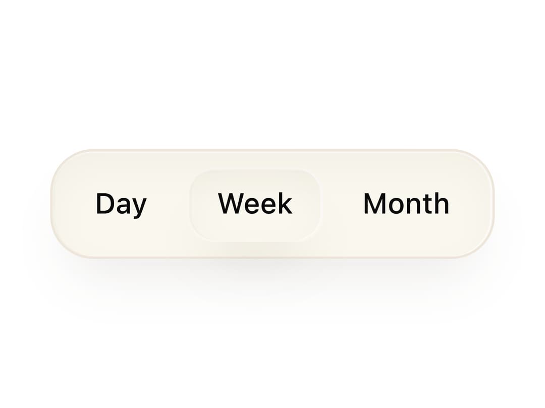
About
A rounded container that groups related buttons together with consistent spacing, padding and a shared surface background.
Built with React and Tailwind. Copy the prompt and paste it into Claude Code, Cursor or Lovable: your agent adds Button Group to your project and fits it to your theme.
Code
How Button Group is used: the demo's code. The component's own source comes with a free account.
Usage.tsx
import ButtonGroup from "@/components/ui/primitive-button-group";
import { Button } from "@/components/ui/button";
import { cn } from "@/lib/utils";

export default function ButtonGroupDemo() {
  return (
    <ButtonGroup>
      <Button
        variant="ghost"
        size="sm"
        className="text-[color:var(--bjork-text-muted)] hover:bg-[var(--bjork-surface-hover)] hover:text-[color:var(--bjork-text)]"
      >
        Day
      </Button>
      <Button
        size="sm"
        className={cn(
          "border border-transparent bg-[var(--bjork-field)] text-[color:var(--bjork-text)]",
          "shadow-[var(--bjork-shadow-surface)] hover:bg-[var(--bjork-surface-hover)]",
        )}
      >
        Week
      </Button>
      <Button
        variant="ghost"
        size="sm"
        className="text-[color:var(--bjork-text-muted)] hover:bg-[var(--bjork-surface-hover)] hover:text-[color:var(--bjork-text)]"
      >
        Month
      </Button>
    </ButtonGroup>
  );
}
More in Buttons
View all
Texture Button
93

Button
20

Eclipse Button
39
Base Button
1

Button Group
4

Button
65

App Store Button
456

Button
1
