
About
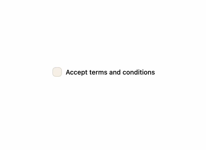
A styled checkbox with a warm accent color and soft inset shadow, built on top of the standard checkbox primitive for forms and settings toggles.
Built with React and Tailwind. Copy the prompt and paste it into Claude Code, Cursor or Lovable: your agent adds Primitive Checkbox to your project and fits it to your theme.
Code
How Primitive Checkbox is used: the demo's code. The component's own source comes with a free account.
Usage.tsx
"use client";

import * as React from "react";
import Checkbox from "@/components/ui/primitive-checkbox";

export default function CheckboxDemo() {
  const [checked, setChecked] = React.useState<boolean>(true);

  return (
    <div className="flex items-center gap-2">
      <Checkbox
        id="terms"
        checked={checked}
        onCheckedChange={(value) => setChecked(!!value)}
      />
      <label
        htmlFor="terms"
        className="text-sm font-medium leading-none text-foreground"
      >
        Accept terms and conditions
      </label>
    </div>
  );
}
More by Isaiah
View all
Agent Plan
2.2K
Voice Powered Orb
1.5K
Video Scroll Hero
1.4K
Reveal Text
1.1K
Portfolio Gallery
975
Leads Data Table
967
Message Dock
855
Ruler Carousel
659
More in Forms
View all

Premium Auth
562

Book A Demo 1
90

Contact Card
1.1K

Login 2
12
Authentication Card
51

Form
139

Card Studio
46
Book A Demo 3
101
