
About
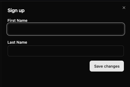
Here is Dialog component
Built with React and Tailwind. Copy the prompt and paste it into Claude Code, Cursor or Lovable: your agent adds Dialog to your project and fits it to your theme.
Code
How Dialog is used: the demo's code. The component's own source comes with a free account.
Usage.tsx
import { Button } from "@/components/ui/button-1"
import {
  DialogContent,
  DialogFooter,
  DialogHeader,
  DialogOverlay,
  DialogTitle,
  DialogTrigger,
} from "@/components/ui/dialog-2"
import { Label } from "@/components/ui/text-field-basic"
import { Input, TextField } from "@/components/ui/text-field-basic"

export default function ModalSheet() {
  return (
    <DialogTrigger>
      <Button variant="outline">Edit Profile</Button>
      <DialogOverlay>
        <DialogContent side="right" className="sm:max-w-[425px]">
          {({ close }) => (
            <>
              <DialogHeader>
                <DialogTitle>Sign up</DialogTitle>
              </DialogHeader>
              <div className="grid gap-4 py-4">
                <TextField autoFocus>
                  <Label>First Name</Label>
                  <Input />
                </TextField>
                <TextField>
                  <Label>Last Name</Label>
                  <Input />
                </TextField>
              </div>
              <DialogFooter>
                <Button onPress={close} type="submit">
                  Save changes
                </Button>
              </DialogFooter>
            </>
          )}
        </DialogContent>
      </DialogOverlay>
    </DialogTrigger>
  )
}
Dependencies
More by James Shopland
View all
Tag Group [react-aria-components]
96
Date Range Picker [react-aria-components]
87
Grid List [react-aria-components]
72
Switch [react-aria-components]
69
Select [react-aria-components]
47
Range Calendar [react-aria-components]
39
Menu
35
Popover
35
More in Buttons
View all

Button
1
Button
6

App Store Button
471

Button
34
Native Button
2

Button
53
Figma File Button
33
Button
74


