
About
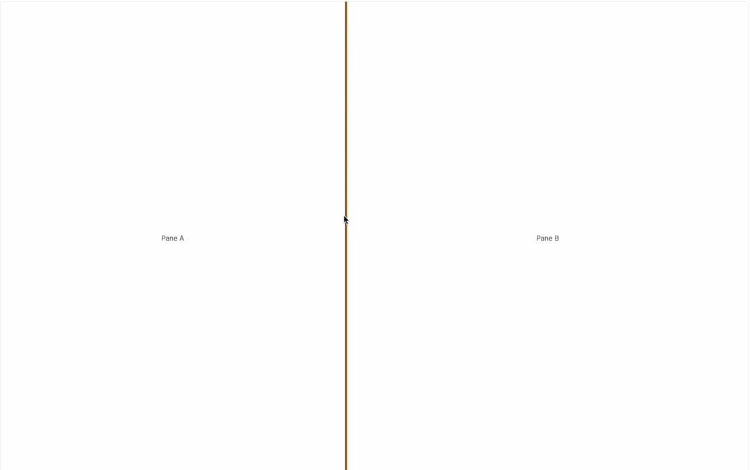
A two-pane split layout with a draggable, keyboard-accessible divider for resizing the panes.
Built with React and Tailwind. Copy the prompt and paste it into Claude Code, Cursor or Lovable: your agent adds Resizable to your project and fits it to your theme.
Code
How Resizable is used: the demo's code. The component's own source comes with a free account.
Usage.tsx
import { Resizable } from "@/components/ui/resizable";

export default function ResizableDemo() {
  return (
    <div className="h-screen w-full bg-background text-foreground">
      <Resizable defaultSplit={40} min={20} max={80}>
        <div className="flex h-full items-center justify-center text-sm text-muted-foreground">
          Pane A
        </div>
        <div className="flex h-full items-center justify-center text-sm text-muted-foreground">
          Pane B
        </div>
      </Resizable>
    </div>
  );
}
More by kemiljk
View all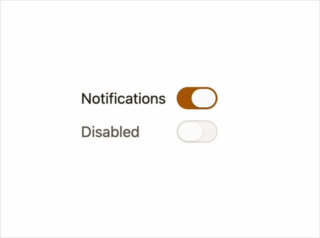
Switch
8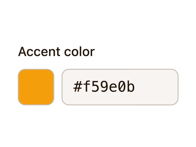
Color Picker
3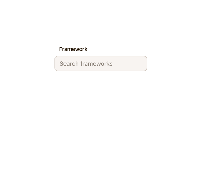
Combobox

Progress
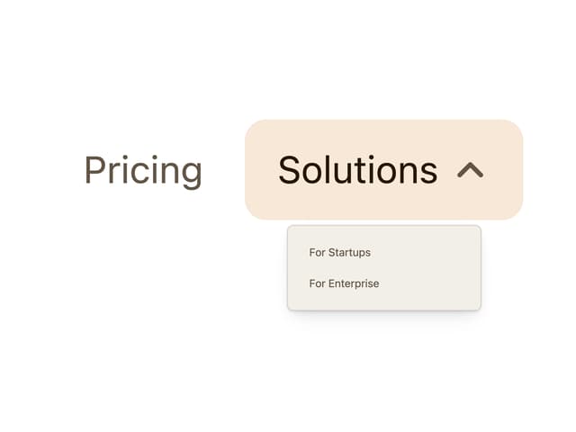
Navigation Menu
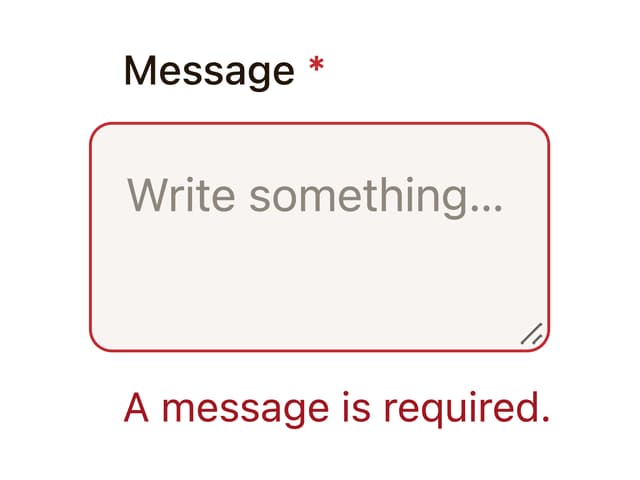
Textarea
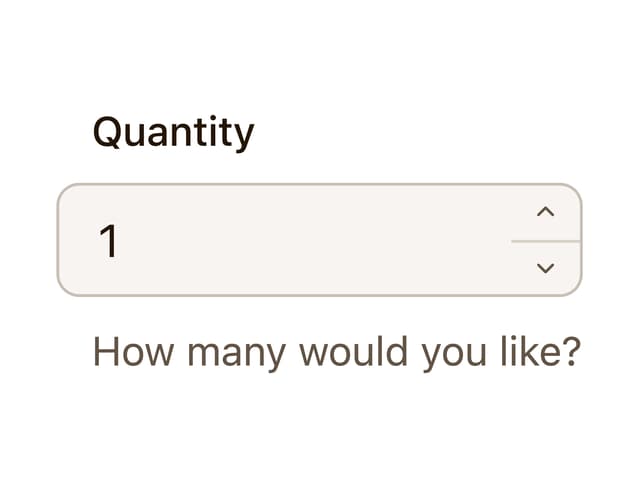
Number Field

Toggle