
About
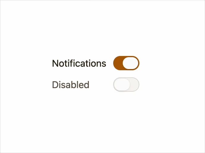
A toggle control for switching a setting on or off, built on a real button with the WAI-ARIA switch pattern for native keyboard and focus support.
Built with React and Tailwind. Copy the prompt and paste it into Claude Code, Cursor or Lovable: your agent adds Switch to your project and fits it to your theme.
Code
How Switch is used: the demo's code. The component's own source comes with a free account.
Usage.tsx
import { Switch } from "@/components/ui/switch";
import { useState } from "react";

export default function SwitchDemo() {
  const [checked, setChecked] = useState(true);

  return (
    <div style={{ display: "flex", flexDirection: "column", gap: "0.75rem" }}>
      <Switch checked={checked} onCheckedChange={setChecked}>
        Notifications
      </Switch>
      <Switch defaultChecked={false} disabled>
        Disabled
      </Switch>
    </div>
  );
}
More by kemiljk
View all
Avatar
Checkbox
Scroll Area
Skeleton