
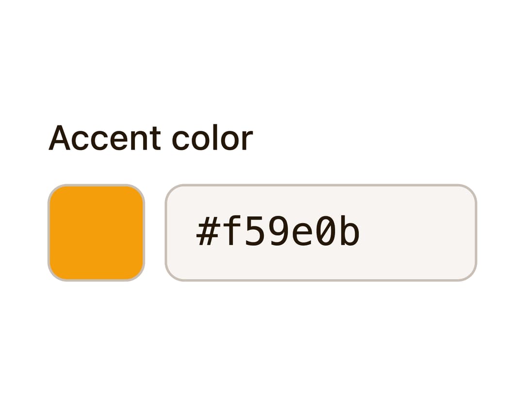
About
A color input built on the real native input[type=color] with a decorative swatch overlay and an editable hex text field that stay in sync with the same value.
Built with React and Tailwind. Copy the prompt and paste it into Claude Code, Cursor or Lovable: your agent adds Color Picker to your project and fits it to your theme.
Code
How Color Picker is used: the demo's code. The component's own source comes with a free account.
Usage.tsx
import { ColorPicker } from "@/components/ui/color-picker";

export default function ColorPickerDemo() {
  return <ColorPicker label="Accent color" defaultValue="#f59e0b" />;
}
More by kemiljk
View all
Switch
8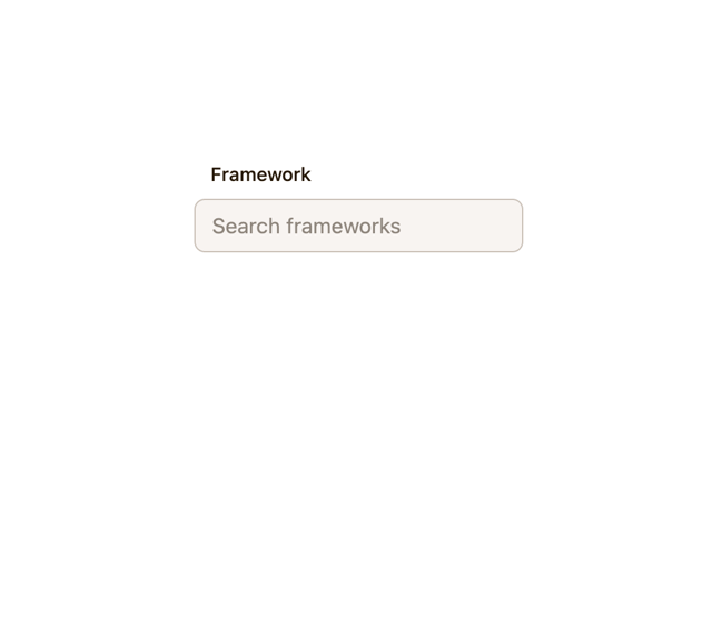
Combobox

Progress
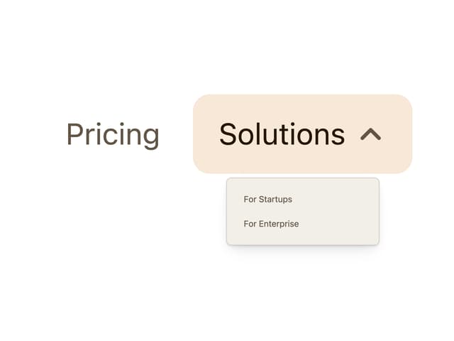
Navigation Menu

Toggle
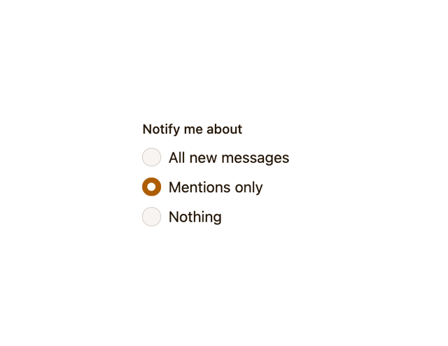
Radio Group

Avatar
Checkbox
More in Forms
View all

Form
18

Premium Auth
570

Login 1
63

Contact Card
1.1K

Card Studio
47

Book A Demo 1
91
Authentication Card
52
Book A Demo 3
102
