
About
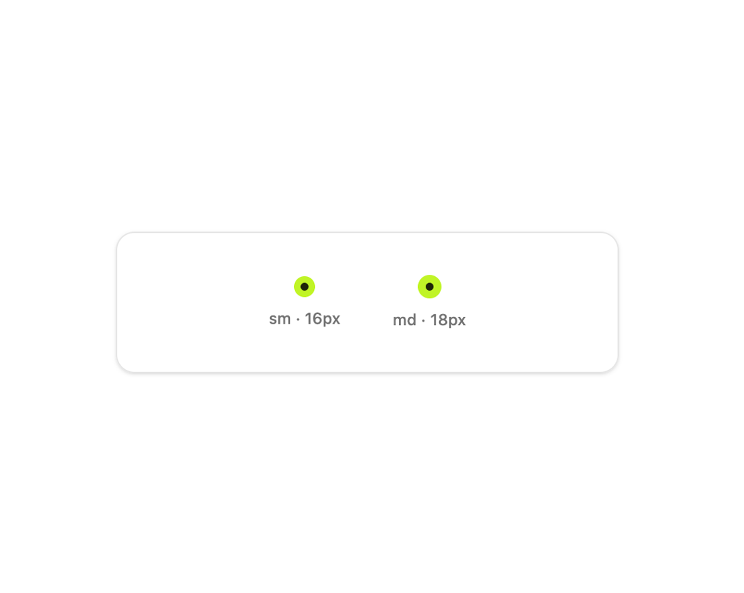
A native-feeling radio input with the selected dial drawn on it, used as the single control inside a radio group for picking one option among several.
Built with React and Tailwind. Copy the prompt and paste it into Claude Code, Cursor or Lovable: your agent adds Radio to your project and fits it to your theme.
Code
How Radio is used: the demo's code. The component's own source comes with a free account.
Usage.tsx
"use client";

import Radio from "@/components/ui/radio";
import { useState } from "react";

export default function RadioSizesDemo() {
  const [sm, setSm] = useState(true);
  const [md, setMd] = useState(true);

  return (
    <div className="flex w-full items-center justify-center bg-background p-10">
      <div className="flex w-full max-w-sm items-center justify-center gap-10 rounded-xl border border-border bg-card p-8 shadow-sm">
        <label className="flex flex-col items-center gap-2">
          <Radio
            dotSize="sm"
            name="size-sm"
            checked={sm}
            onChange={() => setSm(true)}
          />
          <span className="text-xs font-medium text-muted-foreground">
            sm · 16px
          </span>
        </label>
        <label className="flex flex-col items-center gap-2">
          <Radio
            dotSize="md"
            name="size-md"
            checked={md}
            onChange={() => setMd(true)}
          />
          <span className="text-xs font-medium text-muted-foreground">
            md · 18px
          </span>
        </label>
      </div>
    </div>
  );
}
More by klyv-ui
View all
Gantt Chart
68
Klyv Animated Beam
56
Shader Canvas
54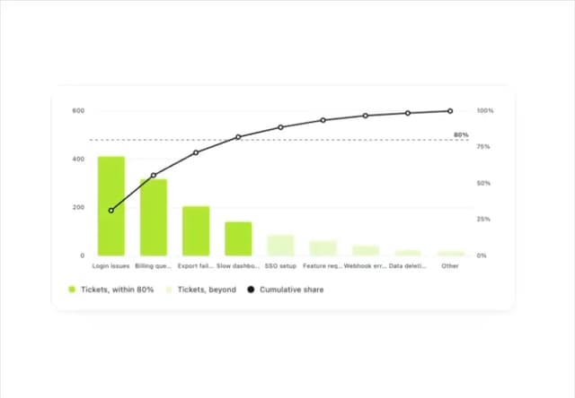
Pareto Chart
49
Fluid Canvas
29
Sunburst Chart
28
Gooey Loader
26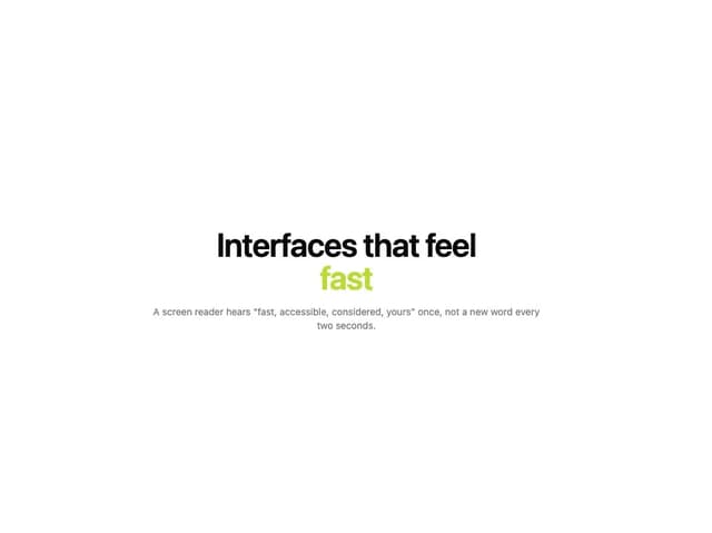
Morphing Text
23
More in Forms
View all

Premium Auth
533

Contact Card
1K

Book A Demo 1
77

Card Studio
43

Login 2
8
Login Card
29

Form
17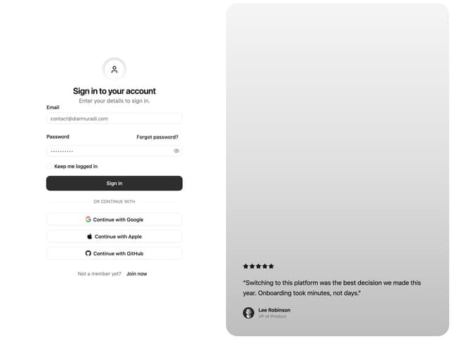

Split Sign In Form
76
