
About
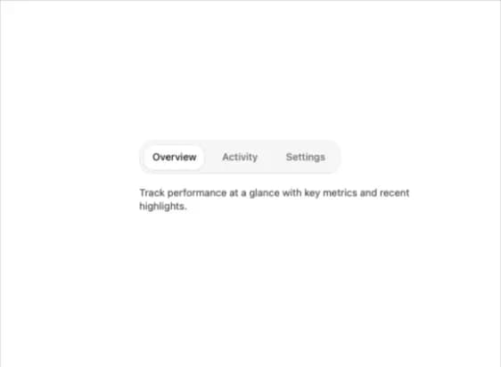
An animated tabs component with a sliding selection highlight, scrollable tab list with edge-fade arrows for overflow, and height-morphing content panels that smoothly resize between tabs.
Built with React and Tailwind. Copy the prompt and paste it into Claude Code, Cursor or Lovable: your agent adds Animated Tabs to your project and fits it to your theme.
Code
How Animated Tabs is used: the demo's code. The component's own source comes with a free account.
Usage.tsx
"use client";

import { Tabs, TabsList, TabsTrigger, TabsContent } from "@/components/ui/tabs";

export default function TabsDemo() {
  return (
    <Tabs defaultValue="overview" className="w-full max-w-md">
      <TabsList>
        <TabsTrigger value="overview">Overview</TabsTrigger>
        <TabsTrigger value="activity">Activity</TabsTrigger>
        <TabsTrigger value="settings">Settings</TabsTrigger>
      </TabsList>
      <TabsContent value="overview">
        Track performance at a glance with key metrics and recent highlights.
      </TabsContent>
      <TabsContent value="activity">
        A running log of recent actions across your workspace.
      </TabsContent>
      <TabsContent value="settings">
        Manage preferences, notifications, and account details.
      </TabsContent>
    </Tabs>
  );
}
Dependencies
More by kuratlielia
View all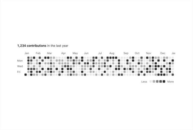
Activity Heatmap
328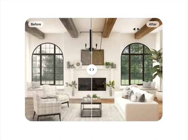
Image Compare
102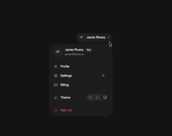
User Menu
93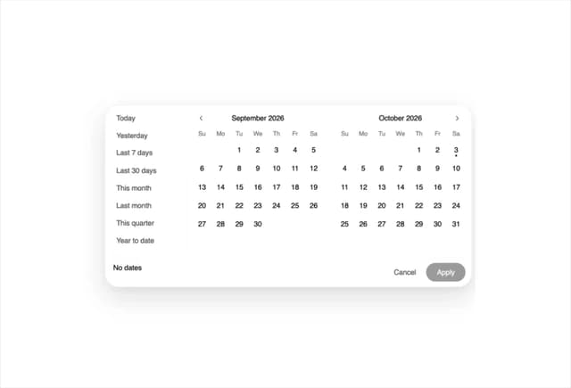
Date Range Picker
62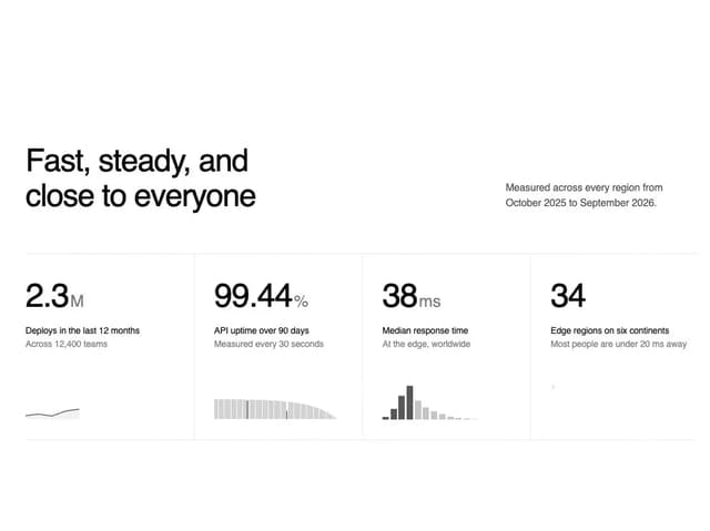
Stats Band
50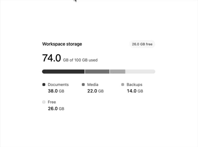
Usage Meter
45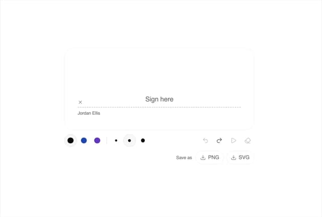
Signature Pad
36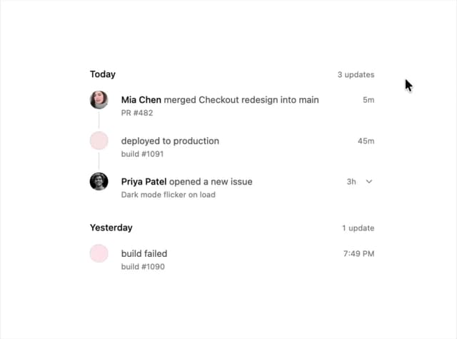
Timeline
33
More in Navigation
View all

Sidebar
223

Tabs
51
Navbar with Theme Toggle
40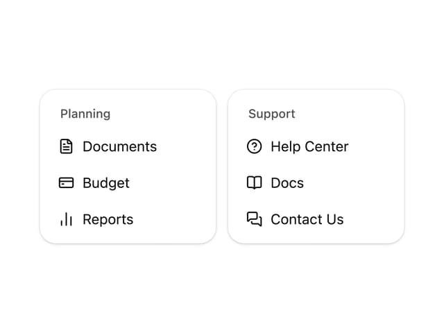
Nav List Card
29

Breadcrumb
12
Pagination Ant
3

Pagination
85
Pagination
9


