
About
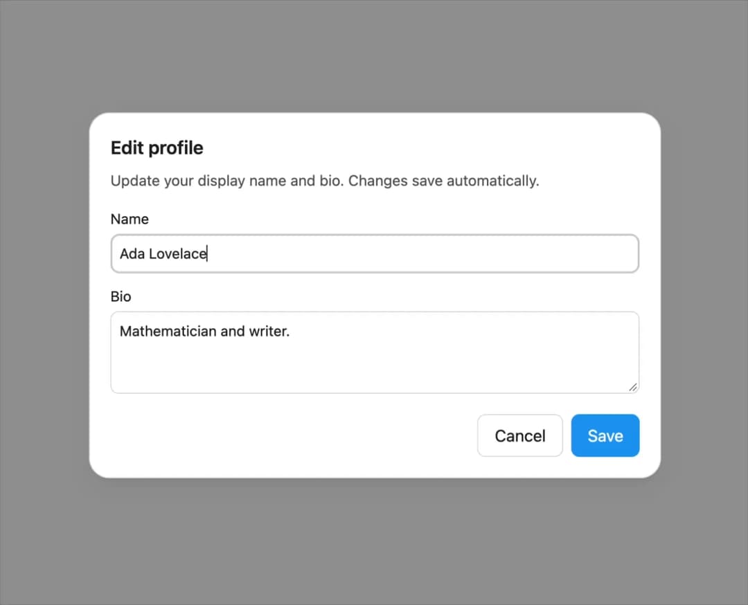
A modal dialog built on the native HTML dialog element, with focus trapping, Escape-to-close, backdrop click-to-close, and automatic scroll/focus restoration.
Built with React and Tailwind. Copy the prompt and paste it into Claude Code, Cursor or Lovable: your agent adds Dialog to your project and fits it to your theme.
Code
How Dialog is used: the demo's code. The component's own source comes with a free account.
Usage.tsx
"use client";

import Dialog from "@/components/ui/dialog";
import { useState } from "react";

export default function DialogDemo() {
  const [open, setOpen] = useState(false);

  return (
    <div className="flex min-h-[420px] w-full items-center justify-center bg-background p-8 text-foreground">
      <button
        type="button"
        className="inline-flex h-10 items-center justify-center rounded-md bg-primary px-4 text-sm font-medium text-primary-foreground transition-colors hover:opacity-90"
        onClick={() => setOpen(true)}
      >
        Edit profile
      </button>
      <Dialog open={open} onClose={() => setOpen(false)} label="Edit profile">
        <h2 style={{ margin: 0, fontSize: "1.125rem", fontWeight: 600 }}>
          Edit profile
        </h2>
        <p style={{ marginTop: "0.5rem", fontSize: "0.9rem", opacity: 0.75 }}>
          Update your display name and bio. Changes save automatically.
        </p>
        <form
          onSubmit={(event) => {
            event.preventDefault();
            setOpen(false);
          }}
          style={{
            marginTop: "1rem",
            display: "flex",
            flexDirection: "column",
            gap: "0.75rem",
          }}
        >
          <label
            style={{
              display: "flex",
              flexDirection: "column",
              gap: "0.25rem",
              fontSize: "0.875rem",
            }}
          >
            Name
            <input
              defaultValue="Ada Lovelace"
              style={{
                padding: "0.5rem",
                borderRadius: "8px",
                border: "1px solid var(--lk-color-emphasis-300)",
                background: "transparent",
                color: "inherit",
              }}
            />
          </label>
          <label
            style={{
              display: "flex",
              flexDirection: "column",
              gap: "0.25rem",
              fontSize: "0.875rem",
            }}
          >
            Bio
            <textarea
              defaultValue="Mathematician and writer."
              rows={3}
              style={{
                padding: "0.5rem",
                borderRadius: "8px",
                border: "1px solid var(--lk-color-emphasis-300)",
                background: "transparent",
                color: "inherit",
                resize: "vertical",
              }}
            />
          </label>
          <div
            style={{
              display: "flex",
              justifyContent: "flex-end",
              gap: "0.5rem",
              marginTop: "0.5rem",
            }}
          >
            <button
              type="button"
              onClick={() => setOpen(false)}
              style={{
                padding: "0.5rem 1rem",
                borderRadius: "8px",
                border: "1px solid var(--lk-color-emphasis-300)",
                background: "transparent",
                color: "inherit",
                cursor: "pointer",
              }}
            >
              Cancel
            </button>
            <button
              type="submit"
              style={{
                padding: "0.5rem 1rem",
                borderRadius: "8px",
                border: "none",
                background: "#1d9bf0",
                color: "#fff",
                cursor: "pointer",
              }}
            >
              Save
            </button>
          </div>
        </form>
      </Dialog>
    </div>
  );
}
Dependencies
More by lailai0916
View all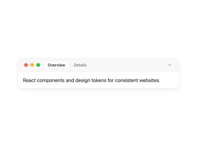
Window Panel
6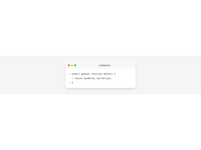
Window Bar
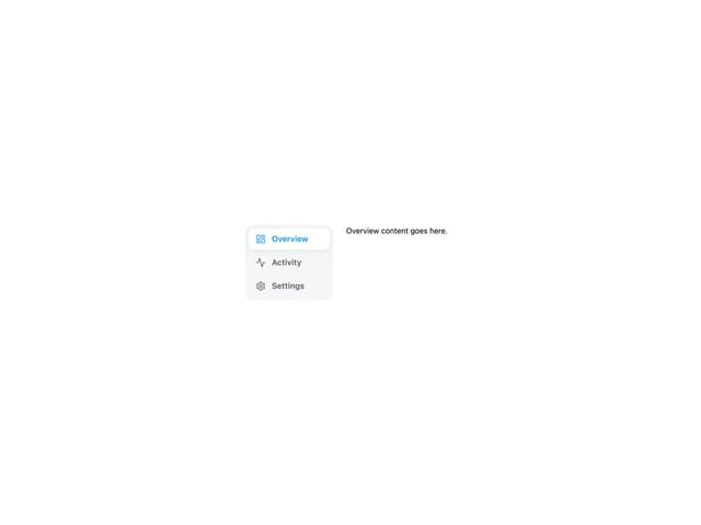
Tabs

Scrollable Data Table
Skip Link
Site Header
Skeleton
Segmented
More in Forms
View all

Premium Auth
504

Login 1
52
Authentication Card
47

Book A Demo 3
83

Contact Card
1K
Book A Demo 1
70
Book A Demo 4
52

Form
136
