
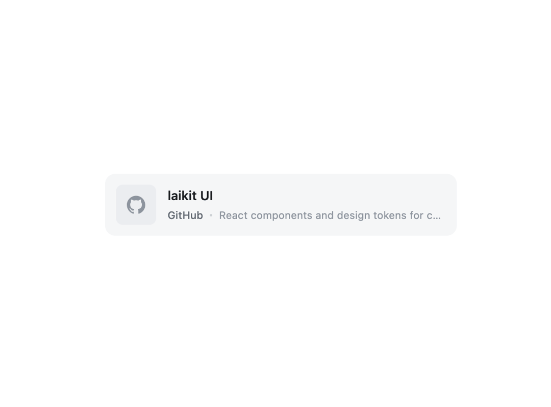
About
A clickable link-preview card that shows a title, description and either a thumbnail image or an auto-detected source icon (GitHub, X, YouTube, etc.) for a shared URL.
Built with React and Tailwind. Copy the prompt and paste it into Claude Code, Cursor or Lovable: your agent adds Share Card to your project and fits it to your theme.
Code
How Share Card is used: the demo's code. The component's own source comes with a free account.
Usage.tsx
import ShareCard from "@/components/ui/share-card";

export default function ShareCardDemo() {
  return (
    <div
      style={{
        background: "var(--lk-background-color)",
        color: "var(--lk-font-color-base)",
        padding: "2rem",
        minHeight: "320px",
        display: "flex",
        alignItems: "center",
        justifyContent: "center",
      }}
    >
      <div style={{ width: "100%", maxWidth: 420 }}>
        <ShareCard
          url="https://github.com/lailai0916/ui"
          title="laikit UI"
          description="React components and design tokens for consistent websites."
        />
      </div>
    </div>
  );
}
More by lailai0916
View all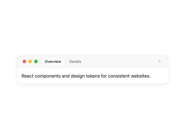
Window Panel
8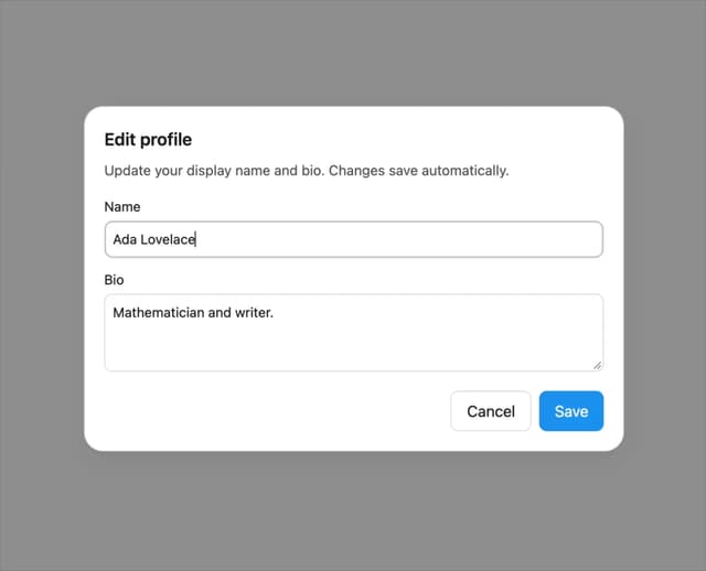
Dialog
1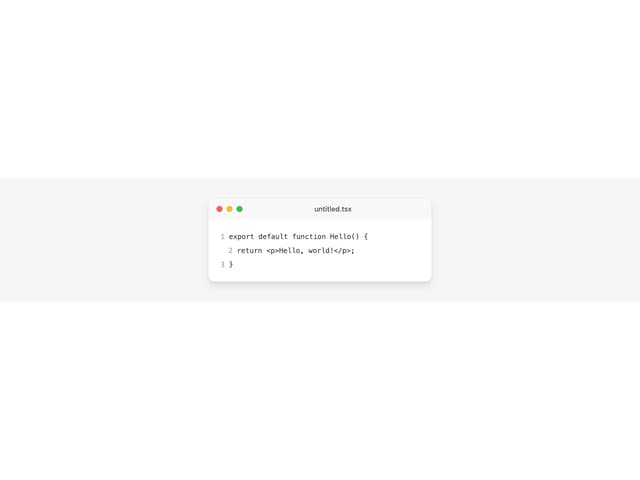
Window Bar
Tabs

Scrollable Data Table
Skip Link
Site Header

Skeleton
More in Cards
View all

Course Design Cards
1.1K

Interactive Tech Stack Bento Grid with Hover Effects
260
Stats cards with links
125

Statistics Card 2
277

Weather Card
60
The Item one
3
Statistics Card 10
272
Statistics Card 7
302
