
About
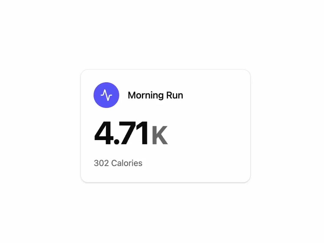
Activity Stats Card A visually polished card component to display a key metric with an icon, title, and subtext. It features a count-up animation for the primary metric and is built to be easily customized through props.
Built with React and Tailwind. Copy the prompt and paste it into Claude Code, Cursor or Lovable: your agent adds Activity Stats Card to your project and fits it to your theme.
Code
How Activity Stats Card is used: the demo's code. The component's own source comes with a free account.
Usage.tsx
import { StatsCard } from "@/components/ui/activity-stats-card"; // Adjust the import path
import { Activity } from "lucide-react"; // FINAL CORRECTION: Use the 'Activity' icon

export default function StatsCardDemo() {
  return (
    <div className="flex h-full w-full items-center justify-center bg-background p-4">
      <StatsCard
        title="Morning Run"
        metric={4.91}
        metricUnit="K"
        subtext="302 Calories"
        icon={<Activity className="h-6 w-6" />}
        iconContainerClassName="bg-indigo-500 text-white"
      />
    </div>
  );
}
Dependencies
More by LaviKatiyar
View all
Hero Section
809
Cards
581
Service Card
557
Card
511
Alert Toast
485
Bento Grid
389
Freelancer Profile Card
362
Referral Card
291
More in Dashboards
View all
Dashboard with Collapsible Sidebar
2.5K

Sidebar
274

SaaS Template
2.5K

Chat template
608
Rate Limit Meter
23
Stats Bento
1.1K

System Status Block
309

Course Design Cards
1.1K


