
About
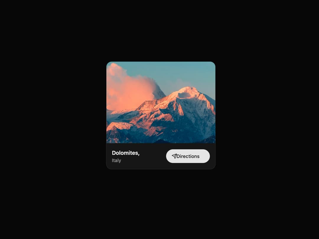
Location Card A visually polished card component to display a location with an image, title, subtitle, and an animated call-to-action button. It is fully responsive, theme-adaptive, and includes subtle animations using framer-motion.
Built with React and Tailwind. Copy the prompt and paste it into Claude Code, Cursor or Lovable: your agent adds Location Card to your project and fits it to your theme.
Code
How Location Card is used: the demo's code. The component's own source comes with a free account.
Usage.tsx
import { LocationCard } from "@/components/ui/location-card"; // Adjust the import path accordingly

const LocationCardDemo = () => {
  return (
    <div className="flex min-h-[400px] w-full items-center justify-center bg-background p-4">
      <LocationCard
        imageUrl="https://cdn.21st.dev/assets/mirror/45/459200ecb3f9516faa4f15b6113d4b7e0f4d0fa0407864e87a19c49861f2f8f0.jpg"
        location="Dolomites"
        country="Italy"
        href="https://www.google.com/maps/place/Dolomites"
      />
    </div>
  );
};

export default LocationCardDemo;
Dependencies
More by LaviKatiyar
View all
Hero Section
837
Cards
663
Service Card
615
Card
545
Alert Toast
493
Bento Grid
420
Freelancer Profile Card
372
Referral Card
304
More in Buttons
View all
Button
12

Notification Button
115
Texture Button
105

HeroUI Button Group
2

App Store Button
482
Split Button
16
Button
78

Button
5


