About
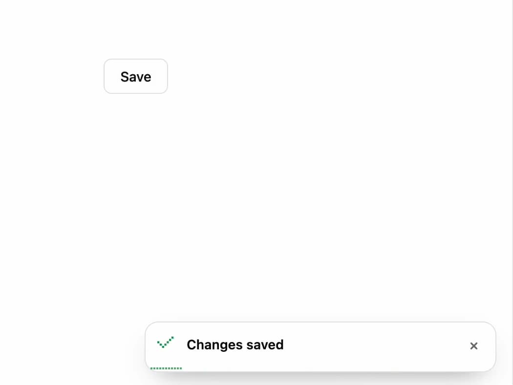
A stacked toast notification component with pixel-art status icons and a draining timer bar that pauses on hover or focus, optionally pinned to a viewport corner.
Built with React and Tailwind. Copy the prompt and paste it into Claude Code, Cursor or Lovable: your agent adds Pixel Toaster to your project and fits it to your theme.
Code
How Pixel Toaster is used: the demo's code. The component's own source comes with a free account.
Usage.tsx
"use client";

import * as React from "react";

import PxToaster, { type PxToasterHandle } from "@/components/ui/px-toaster";

export default function PxToasterDemo() {
  const toaster = React.useRef<PxToasterHandle>(null);

  return (
    <div className="flex h-full w-full items-center justify-center bg-background text-foreground">
      <button
        type="button"
        onClick={() =>
          toaster.current?.show({ title: "Changes saved", type: "success" })
        }
        className="inline-flex h-9 items-center justify-center rounded-md border border-border bg-card px-4 text-sm font-medium text-foreground hover:bg-muted"
      >
        Save
      </button>
      <PxToaster ref={toaster} position="bottom-right" />
    </div>
  );
}
More by lumesec
View all

Geo Traceroute
56
Command Palette
1
Date Picker
Pixel Tabs
Choropleth Map
Copy Button