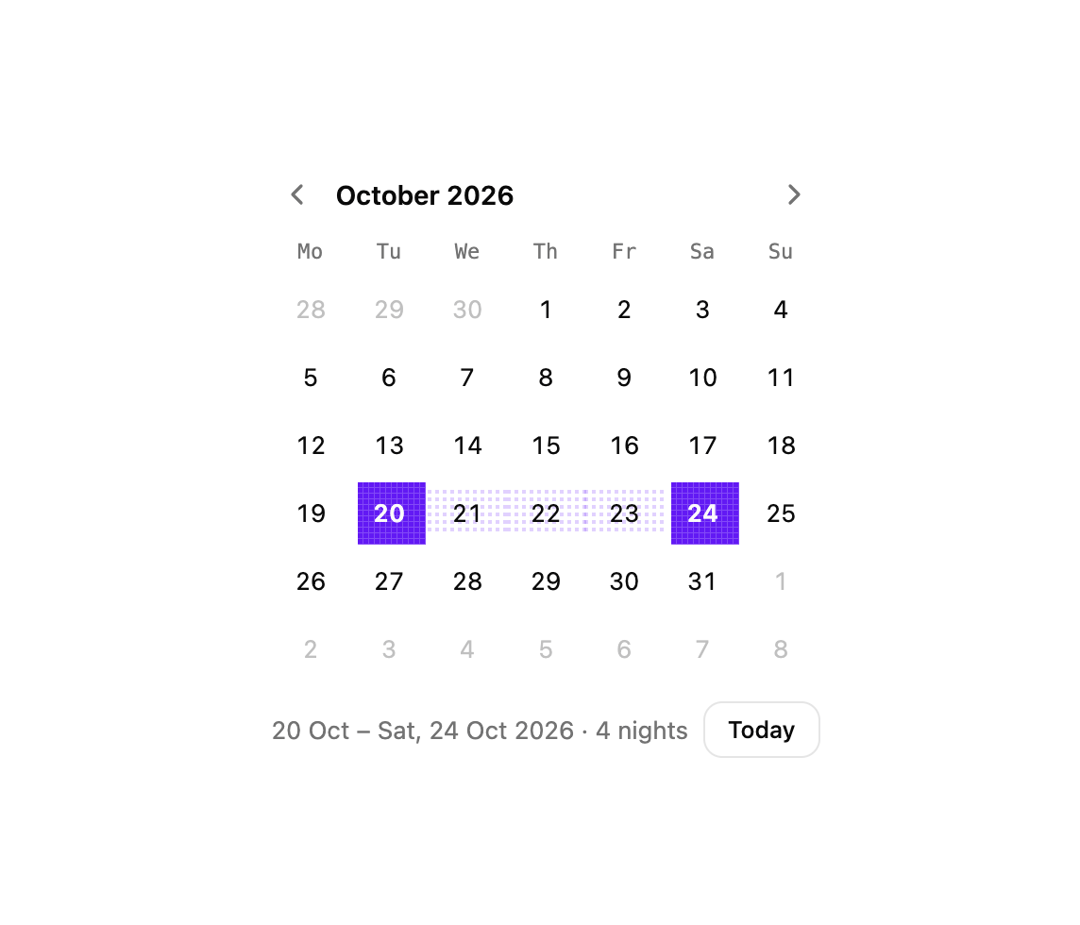
About
A month-grid calendar for picking a single date or a date range, with keyboard navigation and a springy pixel-drawn selection highlight.
Built with React and Tailwind. Copy the prompt and paste it into Claude Code, Cursor or Lovable: your agent adds Date Picker to your project and fits it to your theme.
Code
How Date Picker is used: the demo's code. The component's own source comes with a free account.
Usage.tsx
import { PxDate } from "@/components/ui/px-date";

export default function PxDateDemo() {
  return (
    <div className="flex items-center justify-center p-10">
      <PxDate name="trip" range defaultValue="2026-10-20/2026-10-24" />
    </div>
  );
}
More by lumesec
View all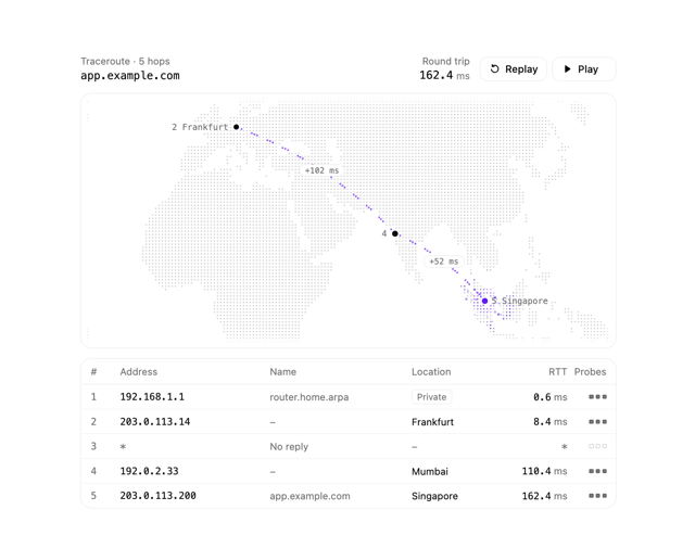

Geo Traceroute
56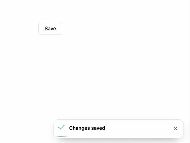
Pixel Toaster
1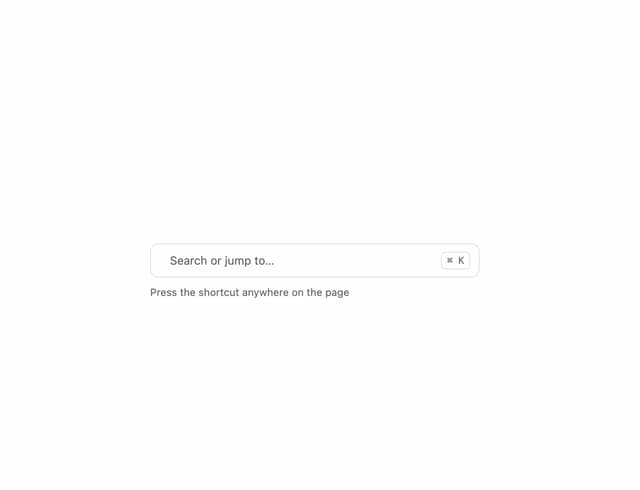
Command Palette
1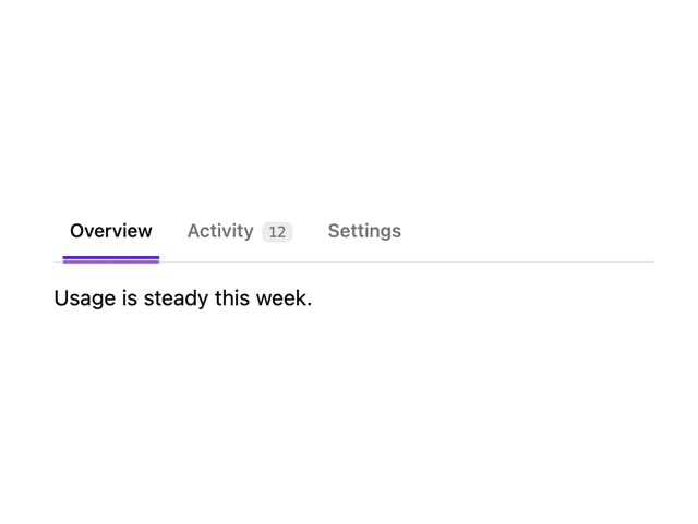
Pixel Tabs
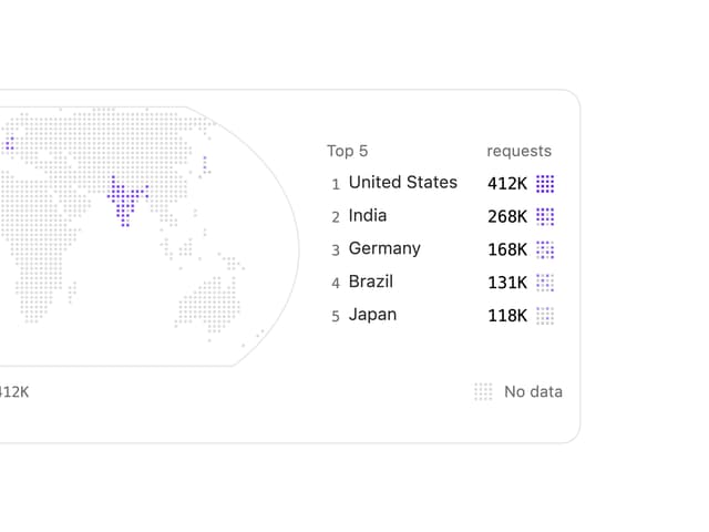
Choropleth Map
Copy Button
More in Forms
View all

Premium Auth
543

Contact Card
1.1K

Form
17

Card Studio
46

Book A Demo 1
80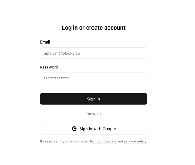

Login 2
10

Login 1
58

Input
14