
About
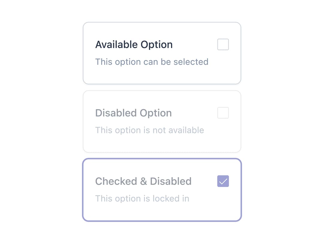
A card-style checkbox selection item with optional icon, label, description and price addon, used to build visual multi-select option groups like notification or payment preferences.
Built with React and Tailwind. Copy the prompt and paste it into Claude Code, Cursor or Lovable: your agent adds Checkbox Card to your project and fits it to your theme.
Code
How Checkbox Card is used: the demo's code. The component's own source comes with a free account.
Usage.tsx
import CheckboxCardItem, {
  CheckboxCardGroup,
} from "@/components/ui/checkbox-card-item";

export default function CheckboxCardDisabledStateDemo() {
  return (
    <CheckboxCardGroup className="max-w-md">
      <CheckboxCardItem
        label="Available Option"
        description="This option can be selected"
      />
      <CheckboxCardItem
        label="Disabled Option"
        description="This option is not available"
        disabled
      />
      <CheckboxCardItem
        label="Checked & Disabled"
        description="This option is locked in"
        disabled
        defaultChecked
      />
    </CheckboxCardGroup>
  );
}
Dependencies
More by Mahmoud Ilyan
View all
Steps
5
Radio Card
1
Switch
1
Textarea

Tabs

Progress
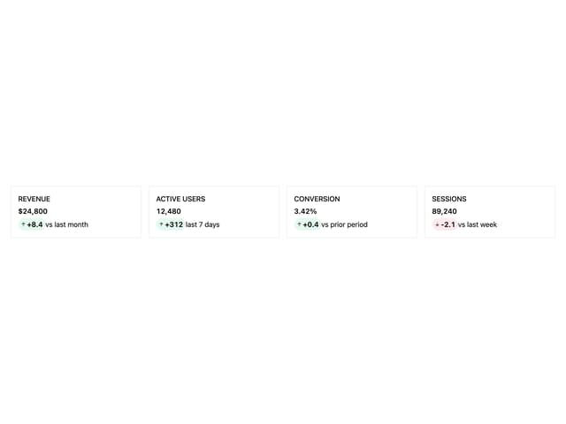
KPI Card
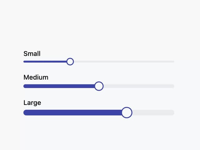
Slider
More in Cards
View all

Course Design Cards
1.3K

Statistics Card 7
327
Statistics Card 2
305

Interactive Tech Stack Bento Grid with Hover Effects
625

Card Studio
5
The Item one
4

Weather Card
65

Card
9